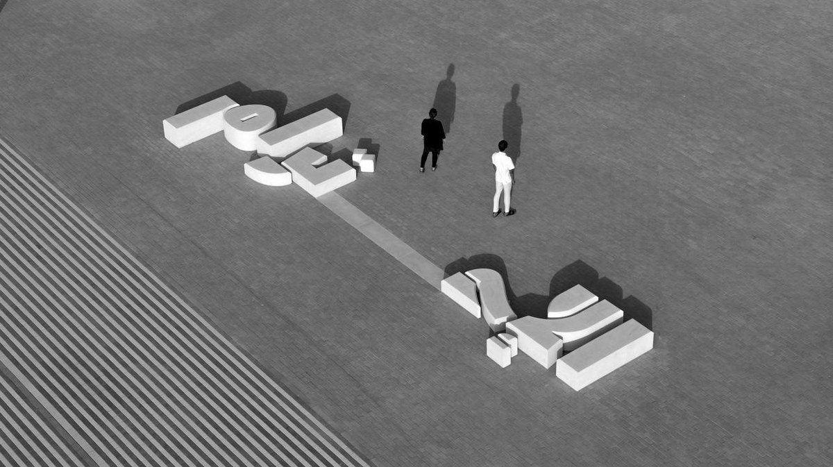
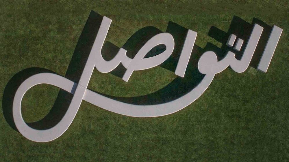
DUBAI: The beauty and complexity of the Arabic language takes the physical form of benches at Expo 2020 Dubai. Visitors to the six-month convention are invited to sit and take in the event on a series of 46 calligraphy-inspired benches, the brainchild of London-based architect Asif Khan and Amsterdam-based typographer and Arabic type designer Lara Captan, who turned crowdsourced words into a functional art piece.
“As an Arabic type designer, I was invited to imagine what the Arabic letters would look like, and for what reason. Asif and his team then brought my digital drawings to the third dimension,” explained Captan to Arab News.

The benches are the brainchild of London-based architect Asif Khan and Amsterdam-based typographer and Arabic type designer Lara Captan. Supplied
“The Arabic word therefore became a sort of product design, where parts of letters or connections between letters were given different heights so that children, adults and people with difficult mobility could all sit on the benches comfortably. Asif’s team also had to find the right seating depth for the words to work as benches, this then dictated the level of thickness I could give to the letters,” she added.
Stretching 10 meters long, the benches are spread throughout the public walkways of the Expo and took about eight to nine months to complete.

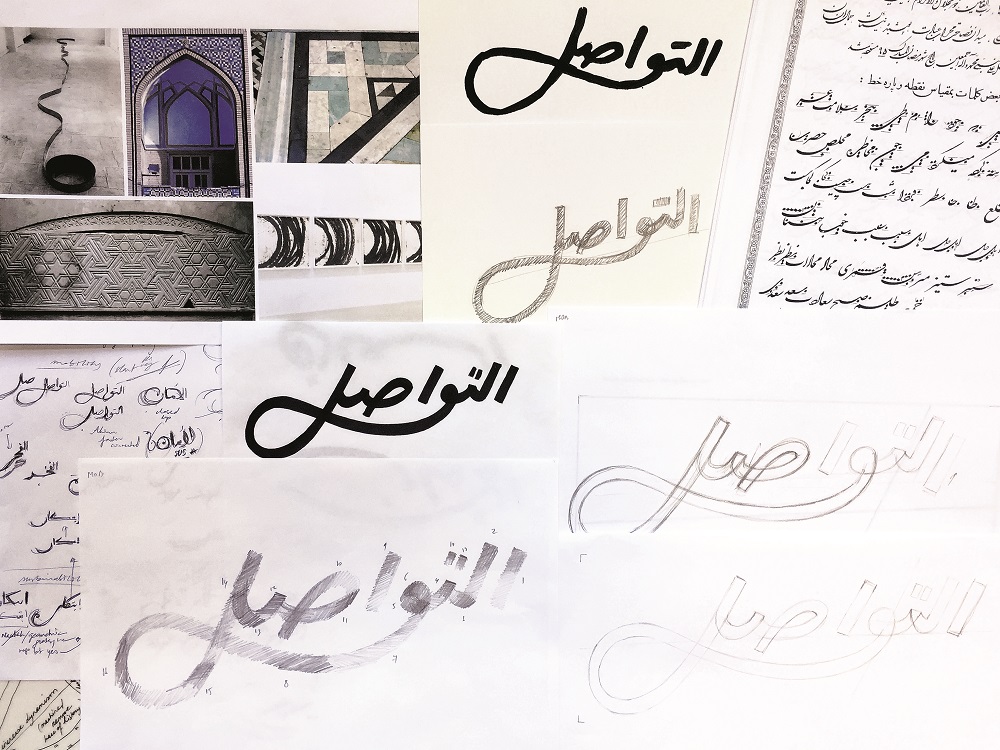
Lara Captan’s sketches for the “Tawasol” bench. Supplied
The words for the benches were originally crowdsourced via Expo 2020’s social media users, who were asked to select words that best represent Expo, its themes (opportunity, mobility and sustainability) and the UAE. Those words were then refined with a group of 30 young Emirati professionals, who made the final selection and decided where the script-based benches should be located on site.
“This project has been unique in many ways,” said Captan. “When it comes to my share of the contribution, the challenge was to answer the question: How can the Arabic words be relevant to the Expo site, readable, enjoyable as art pieces and functional, all at the same time?”
The word choices have been considered to reflect the districts they will be placed in and even the material they are made from. For example, the word for “vision” is see-through, and the bench for the word “dream” is made up of a series of hammocks.
In addition to serving as a resting place for guests to sit and interact with each other, Captan hopes that the benches will create a sense of pride in Arabic-speaking visitors.

The word choices have been considered to reflect the districts they will be placed in and even the material they are made from. Supplied
“I would like people to feel pride in the Arabic writing system, because to me, it is one of the most important contributions of Arab culture,” muses Captan, adding: “I hope they can appreciate our attempt at making the script contemporary, respectful to heritage and alive within a space where the world’s innovations are being exhibited.”
The Lebanese native reveals that she first developed an interest in typography when she was studying graphic design at the American University of Beirut between 2002 and 2006. “I understood that we had a big lack of Arabic fonts, and that the existing ones back then were either not well drawn or heavily westernized. And so I made it my life’s mission to make Arabic typefaces that are authentic and contemporary at the same time,” she said.

Captan hopes that the benches will create a sense of pride in Arabic-speaking visitors. Supplied
Her start, which she describes as “a slow brew” or “a long incubation” came during her fight against the technologies used to make fonts because they do not allow for the optimal rendering of Arabic.
Captan gained international recognition once she started speaking at international type conferences. She went on to receive a subsidy from the Creative Industry Fund NL in the Netherlands that allowed for the conception of her experimental typecases Falak ACE and Falak OTL after five years of work.
Captan counts the inception of her typefaces as one of her proudest career moments alongside seeing her students’ work after the first Arabic type design program and workshop in Beirut, co-founded by her and Arabic type designer Kristyan Sarkis.
She says: “I hope to make many more fonts that push some form of boundary, and to write about everything I’ve learned throughout the years so that future generations of type designers can do a much better job than me.”


