Arabic calligraphy:
Ancient craft,
modern art
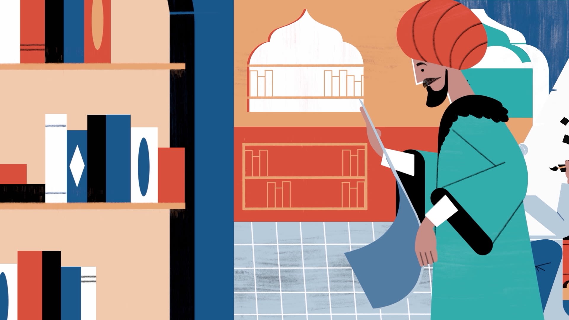
The art of Arabic calligraphy has been enhanced and developed over the course of a millennia. It has written the word of God, helped preserve human knowledge and understanding, and borne witness to the destruction of Baghdad. It has been codified, stylized, and lent itself to abstraction. It has even struggled with the modern world and found renewed life in both art and typography.
Nowhere is calligraphy more revered than in Islam. According to Islamic tradition, God “taught with the pen, taught man that which he knew not” (Qur’an 96:4). No wonder the art of writing is both admired and cherished as a visual expression of faith.
Now it is being celebrated in all its forms, with Saudi Arabia extending the Year of Arabic Calligraphy into 2021 and UNESCO registering the art form on its Lists of Intangible Cultural Heritage. Arabic calligraphy is taking its rightful place at the heart of Arab identity. As the Iraqi calligrapher Wissam Shawkat says: “This is the one thing that is pure for us.”
Tracing origins
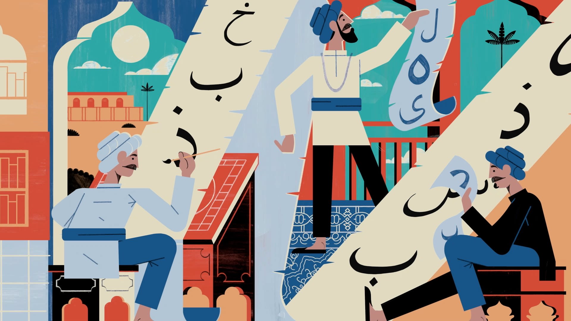
On the banks of the Euphrates river, roughly 170 kilometers south of Baghdad, lies the Iraqi city of Kufa. Once renowned as a center of learning during the Islamic Golden Age, it has now been all but consumed by Najaf.
Kufa is the city that gave its name to Kufic, the earliest example of a universal calligraphic style and a favored script for transcription of the Holy Qur’an. Many of the earliest extant copies of the Islamic holy book, including the Blue Qur’an — a 9th-century manuscript believed to have been produced in Spain — and the Topkapi manuscript, the oldest near-complete Qur’an in existence, were written using this foundational script.
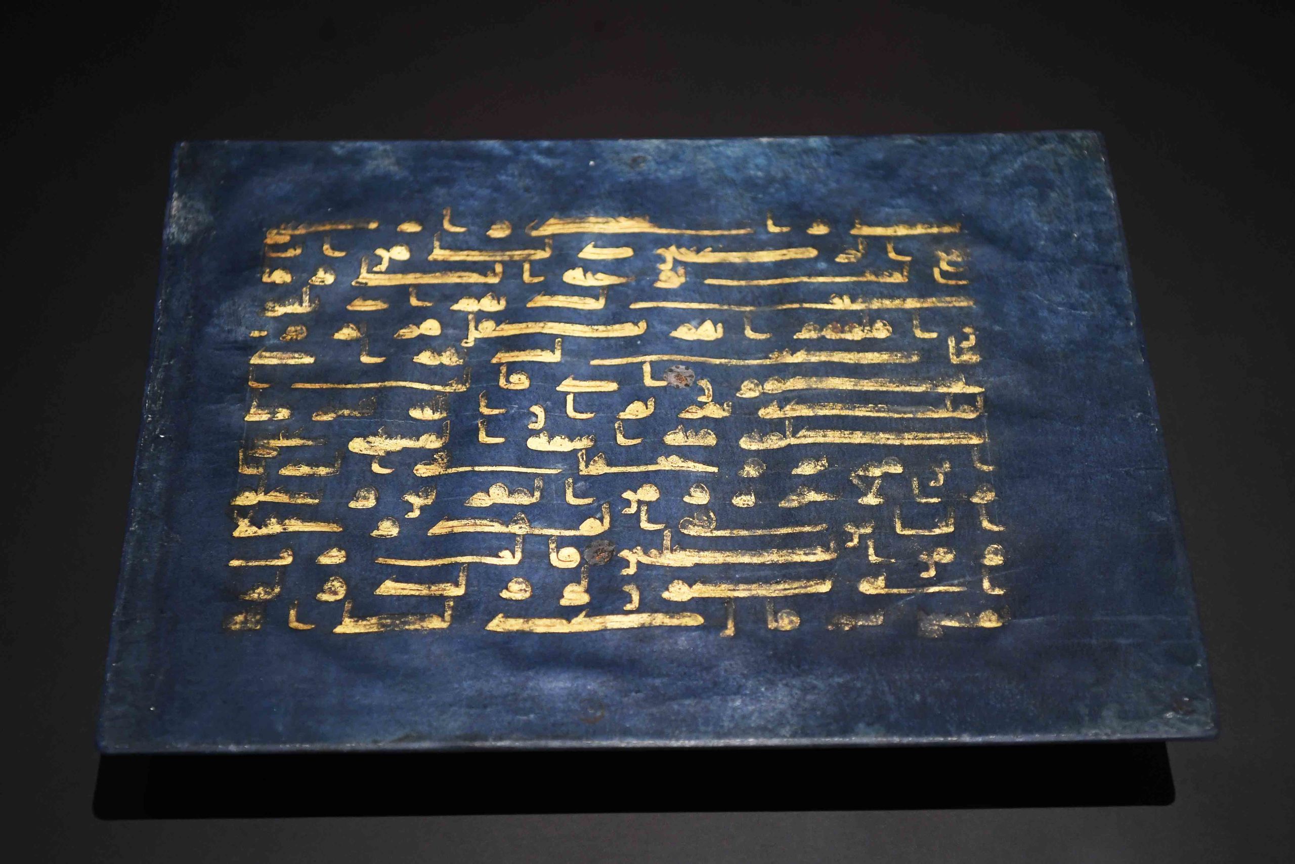
The Blue Qur’an — a 9th-century manuscript believed to have been produced in Spain — was written in Kufic script. (Getty Images)
The Blue Qur’an — a 9th-century manuscript believed to have been produced in Spain — was written in Kufic script. (Getty Images)
Kufic’s geometric elegance also meant it was well suited to architectural decoration, with one of its earliest known examples found in a 240-meter-long Qur’anic inscription inside Jerusalem’s Dome of the Rock. The oldest, however, dates from 644 CE and is engraved on a rock near AlUla in Saudi Arabia, according to the Kingdom’s submission to UNESCO’s Memory of the World register. Known as The Inscription of Zuhayr, it is situated on an ancient trade and pilgrimage route between Al-Mabiyat and Madain Saleh and states the date of death of Umar Ibn Al-Khattab, the second Caliph of the Rashidun Caliphate.
However, the exact origins of Kufic and the scripts that preceded it are unclear. The Arabic alphabet is believed to have evolved from Nabataean, an Aramaic dialect used by a semi-nomadic Arab people who inhabited northern Arabia, the southern Levant and the Sinai Peninsula from around the 4th century BCE. Today, the Nabataeans are best known for the architectural wonders they bequeathed the world, including Petra in Jordan and Madain Saleh in Saudi Arabia. What is less appreciated is their pivotal role in the formation of the Arabic script.
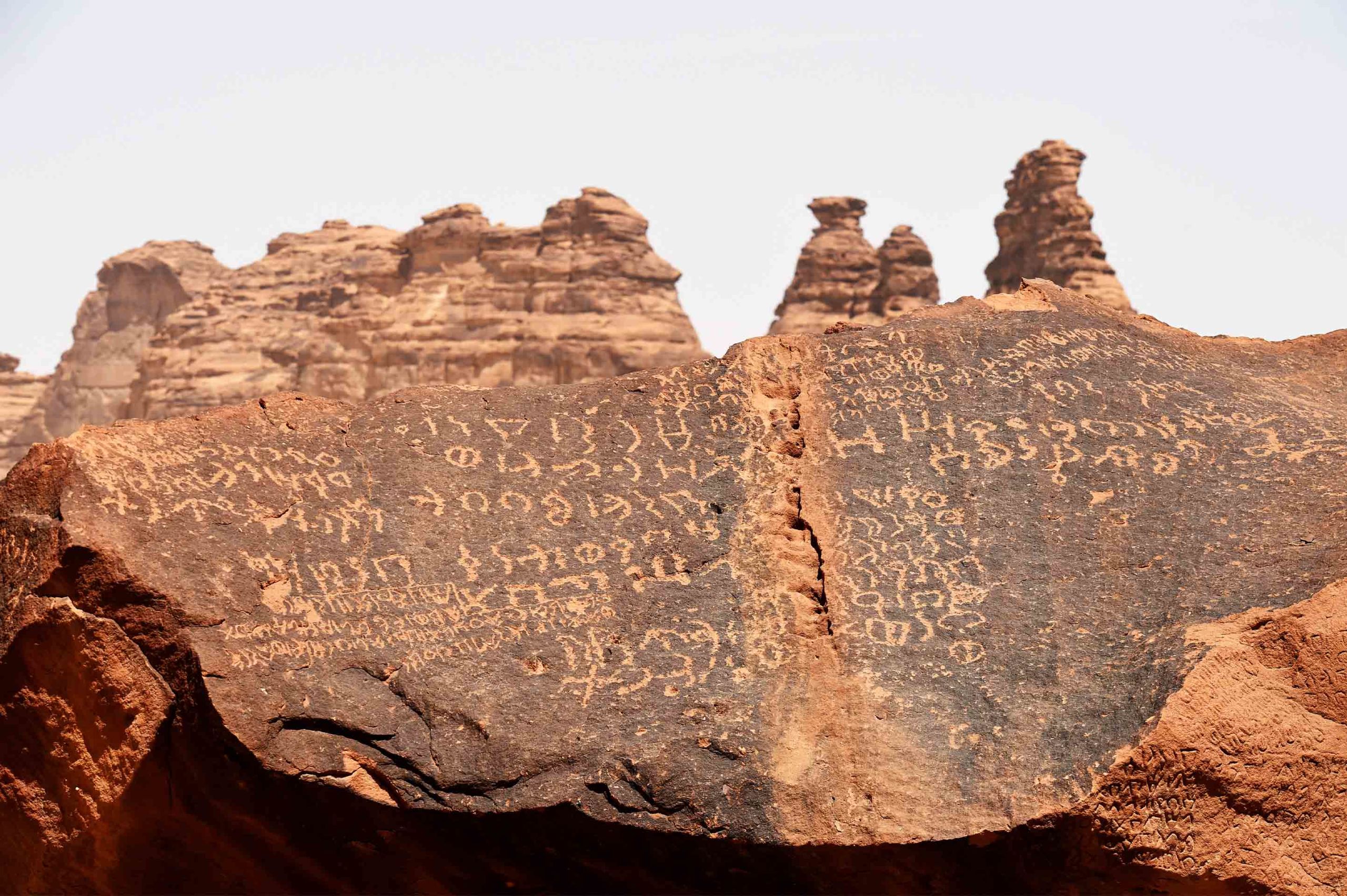
A Nabataean inscription in AlUla in Saudi Arabia. The Arabic alphabet is believed to have evolved from this Aramaic dialect. (Getty Images)
A Nabataean inscription in AlUla in Saudi Arabia. The Arabic alphabet is believed to have evolved from this Aramaic dialect. (Getty Images)
The Nabateans used a form of writing that flowed from right to left and had strong similarities with Arabic, including its cursive nature and its reliance on bodies of text that consisted largely of consonants and long vowels. How Nabataean evolved into Arabic is not precisely clear, but in 2014 a joint Saudi-French archaeological team discovered what is, at present, the oldest known inscription in the Arabic alphabet. Dating from 469 to 470 CE, it was found 100 kilometers north of Najran in Saudi Arabia and is written in a mixed text known as Nabataean Arabic. The discovery, described at the time as the ‘missing link’ between Nabataean and Arabic writing, helps explain why Nabataean is considered the direct precursor to the Arabic script. Prior to this, the earliest extant Arabic inscription was from Namara in modern day Syria (dating from 328 CE), but it is written solely in Nabataean characters.
The earliest form of Arabic script is known as Jazm, which in turn developed into a number of differing styles, including Hiri, Anbari, Makki and Madani. These styles were named after the cities or regions from which they emerged (for example, Makki and Madani were from Makkah and Madinah respectively) and were particular to their time and location. Madani and Makki are also linked together under Hijazi, the collective name for a number of scripts from the Hijaz region. Ma’il, another Hijazi script used in a number of the earliest Qur’anic manuscripts, is believed to be the direct predecessor of Kufic. The so-called "Birmingham Qur'an," from the 7th century CE, is a wonderful, albeit incomplete, example of the Hijazi style.
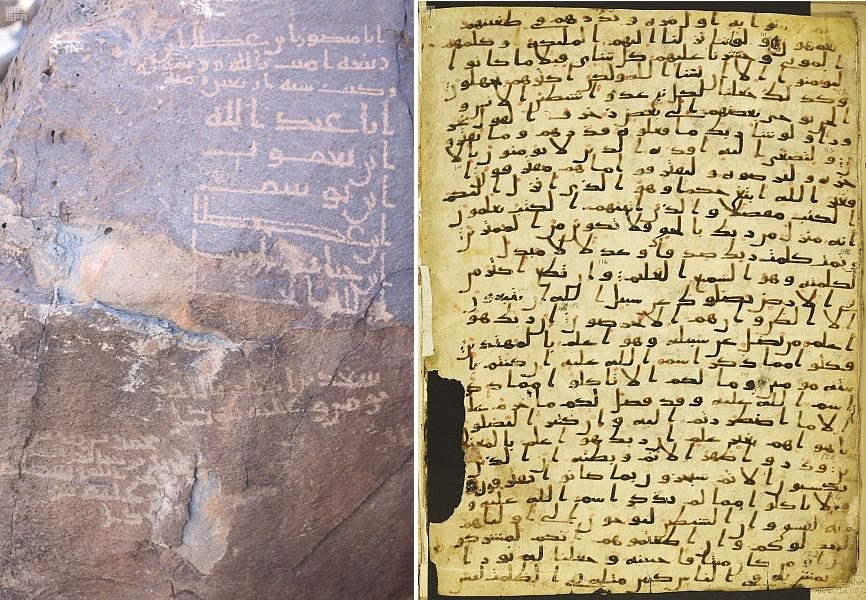
A composite image featuring examples of Madani script, which was developed in Madinah from the earliest form of Arabic script known as Jazm. (SPA)
A composite image featuring examples of Madani script, which was developed in Madinah from the earliest form of Arabic script known as Jazm. (SPA)
Why Kufic emerged as a dominant calligraphic style during the 7th century is open to debate, but its significance lies in the preservation of the Qur’an, the Islamic conquests of the 7th and 8th centuries, and its geometric beauty. As both Islam and the Arabic language spread across North Africa and into the Iberian Peninsula, so the importance of the Arabic script intensified, with the need for an authoritative script that could combine aesthetics with readability. Over time, variations of Kufic would emerge, with Eastern Kufic (created by the Persians), the Maghrebi script (developed in North Africa and the Iberian Peninsula), and plaited and square Kufic epitomizing the evolution of a calligraphic style.
“The Kufic script is considered very important and still relevant today because it was the first script to be used to write the Holy Qur’an,” Saudi calligrapher Nasser Al-Salem explains.
“Kufic is a fascinating calligraphic style because it’s so varied and rich,” adds Bahia Shehab, an artist, historian and professor of design at the American University in Cairo (AUC). “You have the simple square Kufic, you have the early Kufic of the early Qur’ans, you have the Kufic from the East, the Kufic from the West, you have the floriated Kufic, the foliated Kufic, the knotted Kufic. You might think it’s only one style of script, but it’s so rich and varied and I love the geometry of it — the structure of it.”
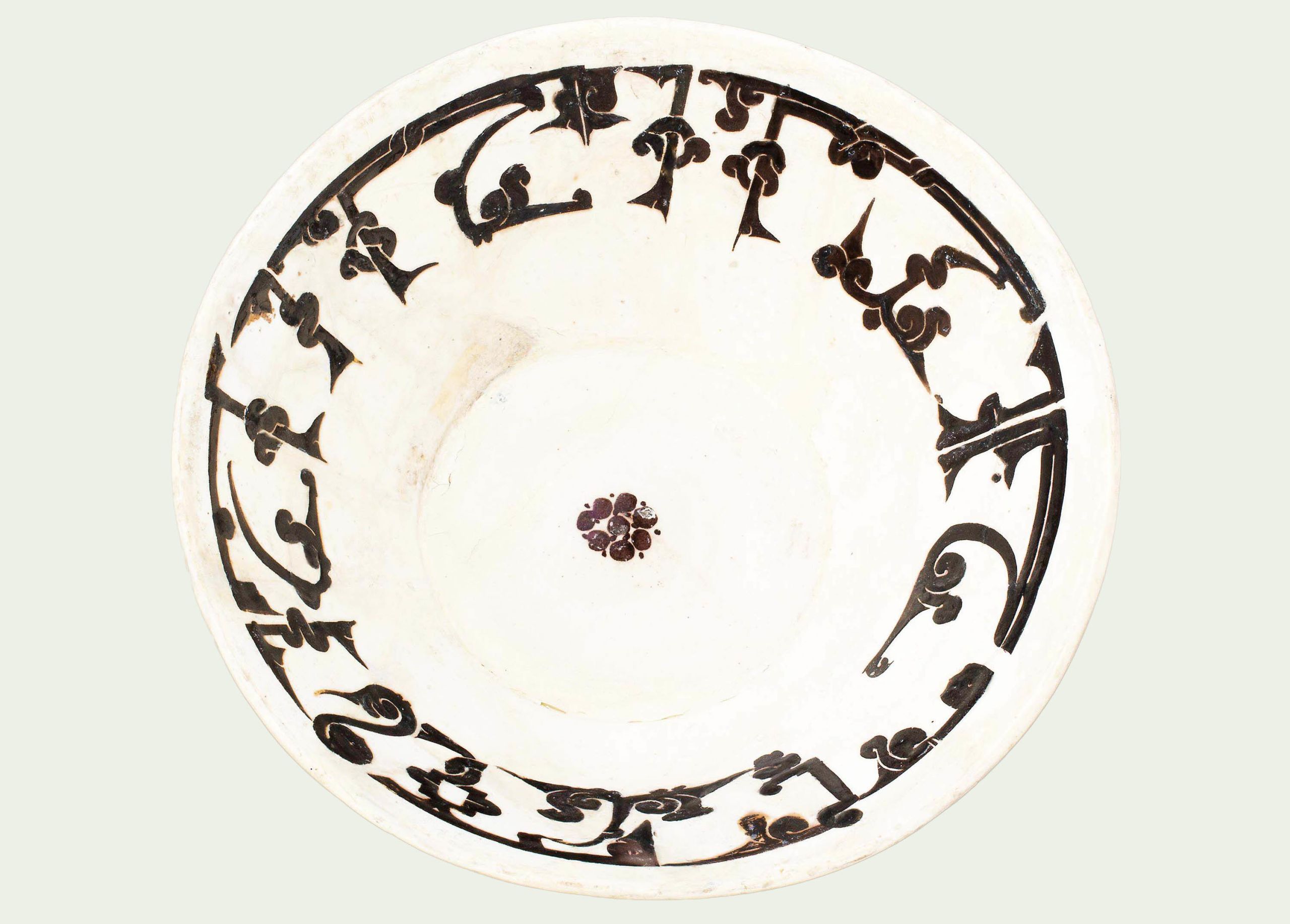
This bowl from around 900 CE hails from present-day Iran and features an example of knotted Kufic script. (Alamy)
This bowl from around 900 CE hails from present-day Iran and features an example of knotted Kufic script. (Alamy)
Early versions of Kufic did not include the dotting that later distinguished letters from one another, nor did they have any signs to display the correct pronunciation of words. A correct interpretation of the text would depend on the skill of the reader, who was assumed to have the knowledge to decipher words that were left with unmarked vowels and without consonant points. This did not change until Abu Al-Aswad Al-Du’ali, considered the father of Arabic grammar, invented a system of consonant differentiation called i’jam and vowel indication (tashkeel) in the second half of the 7th century.
That system was further developed in the 8th century by the philologist and grammarian Al-Khalil Ibn Ahmad Al-Farahidi, who wrote the first Arabic dictionary and introduced a system of short vowel marks known as harakat. Both Al-Du’ali and Al-Farahidi lived and worked in Basra, Iraq.
Writing cursive is much faster than writing geometric script, and if you want to grow an empire, you want to spread your message and you want to write more books.
Although Kufic would remain in use until the 12th century, its popularity waned, primarily because of the emergence of more legible cursive scripts such as Toumar, Muhaqqaq and, in particular, Naskh, which was easier and faster to write and would go on to become the preferred script for books and administrative documents within the Abbasid Caliphate.
“There are many theories about why Kufic went out of use, but the most logical one I’ve read so far is speed,” says Shehab. “Writing cursive is much faster than writing geometric script, and if you want to grow an empire, you want to spread your message and you want to write more books. And writing with a cursive script is faster than writing with a more angular geometric script that needs more precision and time.
“But Kufic never fully disappeared. It has always had revivals. For example, during the Mamluk period, Kufic started reappearing on Ayah headings in the Qur’an and in the famous Sultan Hassan Mosque. There’s an elegance in its geometry and Kufic will forever be used, although we still need to discover what its secret is.”
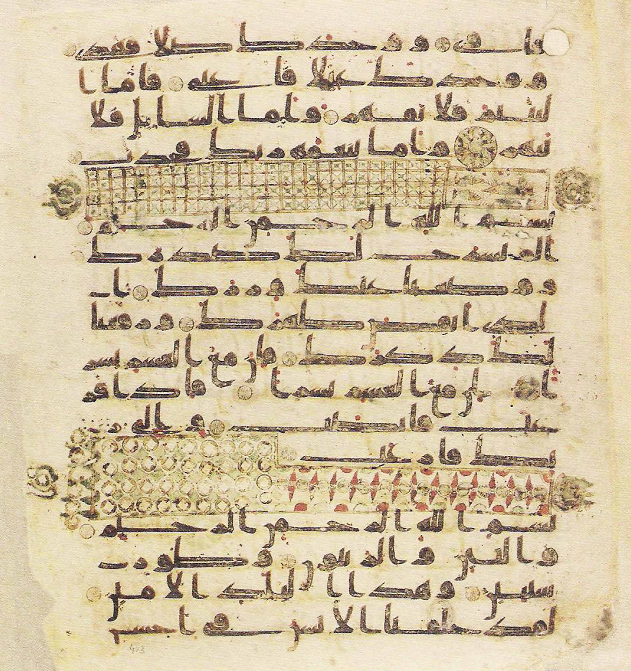
Written in Kufic script, the Topkapi manuscript is the oldest near-complete Qur’an in existence and dates from the 8th century. (Alamy)
Written in Kufic script, the Topkapi manuscript is the oldest near-complete Qur’an in existence and dates from the 8th century. (Alamy)
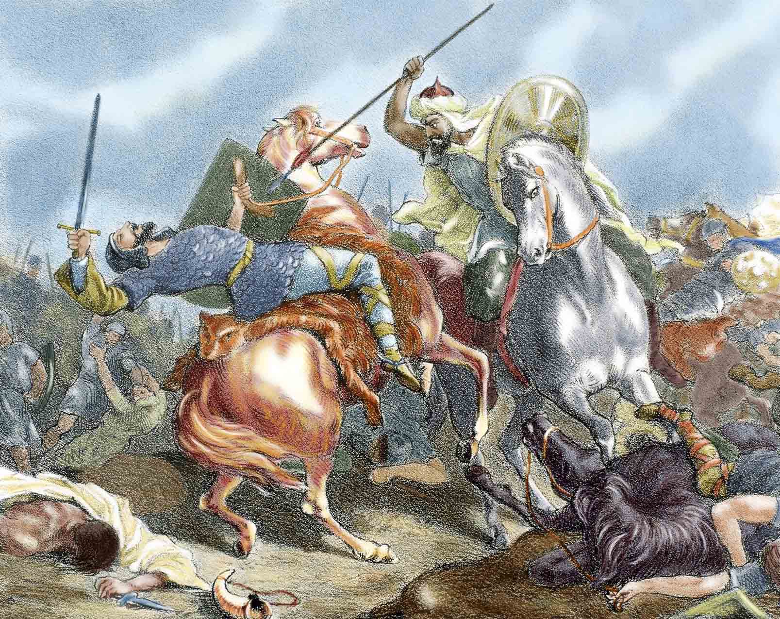
The Islamic conquests of the 7th and 8th centuries intensified the need for a script that could combine aesthetics with readability. Depicted here is the Umayyad Caliphate’s conquest of the Christian Visigothic Kingdom of Hispania in 711. (Getty Images)
The Islamic conquests of the 7th and 8th centuries intensified the need for a script that could combine aesthetics with readability. Depicted here is the Umayyad Caliphate’s conquest of the Christian Visigothic Kingdom of Hispania in 711. (Getty Images)
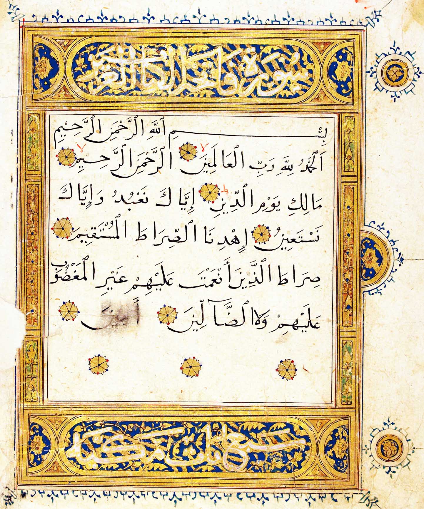
Although Kufic would remain in use until the 12th century, its popularity waned, primarily because of the emergence of more legible cursive scripts such as Naskh, pictured here. (Alamy)
Although Kufic would remain in use until the 12th century, its popularity waned, primarily because of the emergence of more legible cursive scripts such as Naskh, pictured here. (Alamy)
Codifying calligraphy
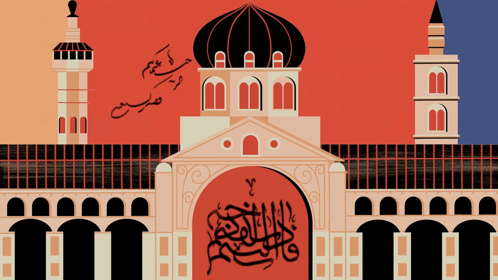
Although largely defined by its angularity and geometric qualities, there were no rules attached to the use of Kufic, nor was there any form of universally accepted standardization. This led to widely differing versions of the script. This lack of standardization would come to an end (for cursive scripts at least) with the arrival of Abu Ali Muhammad Ibn Ali Ibn Muqla — better known simply as Ibn Muqla — a master calligrapher and vizier within the Abbasid Caliphate, and the first person to codify the principles of calligraphy.
Ibn Muqla’s system of proportional scripts (called Al-Khatt Al-Mansub) would mark the birth of visual consistency within the Arabic writing system. Reflecting an association with the divine, the system he developed ensured the letters of any given script were in proportion with one another. This was achieved by establishing the rhomboid dot (created by the nib of a calligrapher’s qalam), the length of the aleph (the first letter of the Arabic alphabet), and the circle (with a diameter equal to the height of the aleph) as the units of measurement by which the size of all letters is calculated. This codified system was applied to six calligraphic scripts known as Al-Aqlam Al-Sitta: Naskh, Muhaqqaq, Rayhani, Thuluth, Riqa (not to be confused with Ruqʿah) and Tawqi. For example, the height of the aleph measures eight dots in Muhaqqaq, seven in Thuluth and six in Tawqi. “You can call Ibn Muqla the engineer of writing,” Al-Salem says of the celebrated calligrapher. “He collected all of this data regarding the techniques of writing. He was the one putting all of this information in one place so that it could be passed on from one generation to another.”
Not a single line of Ibn Muqla's work has survived, but his impact on calligraphy was profound.
Not a single line of Ibn Muqla’s work has survived, but his impact on calligraphy was profound. He brought mathematical accuracy to the reproduction of letters and heightened the aesthetics of calligraphy through geometric design. However, the violent nature of his demise — his right hand was cut off so he could not write, and when he protested with words, his tongue was cut out too — has left an emotional scar. He eventually died in prison in 940 CE.
“What is deep about the legacy of Ibn Muqla is his tragic life, and it affects us all emotionally as calligraphers,” says the Iraqi artist and calligrapher Hassan Massoudy. “Even if we have not seen his work, everyone acknowledges that he delineated and reinforced simplified geometrical rules for the shape of letters. He is the only well-known figure up until the 10th century. Among numerous other calligraphers, he remained the most famous. This gives me hope in terms of the respect that society gave calligraphers. But we are also shocked by the savagery with which he was treated in Abbasid society because he said they had reached such levels of decadence and luxury that they no longer deserved the Kufic script, and ought to be given a softer calligraphic style.”
In the years and centuries following Ibn Muqla’s death his work was refined by Ibn Al-Bawwab and Yaqut Al-Musta’simi, both of whom spent the majority of their lives in Baghdad. The former produced an estimated 64 copies of the Qur’an, the most famous of which — and the only one still in existence — is now in the Chester Beatty Library in Dublin. It is one of the earliest known Qur’ans to have been produced on paper rather than parchment, and one of the earliest to have been written in the Naskh script.
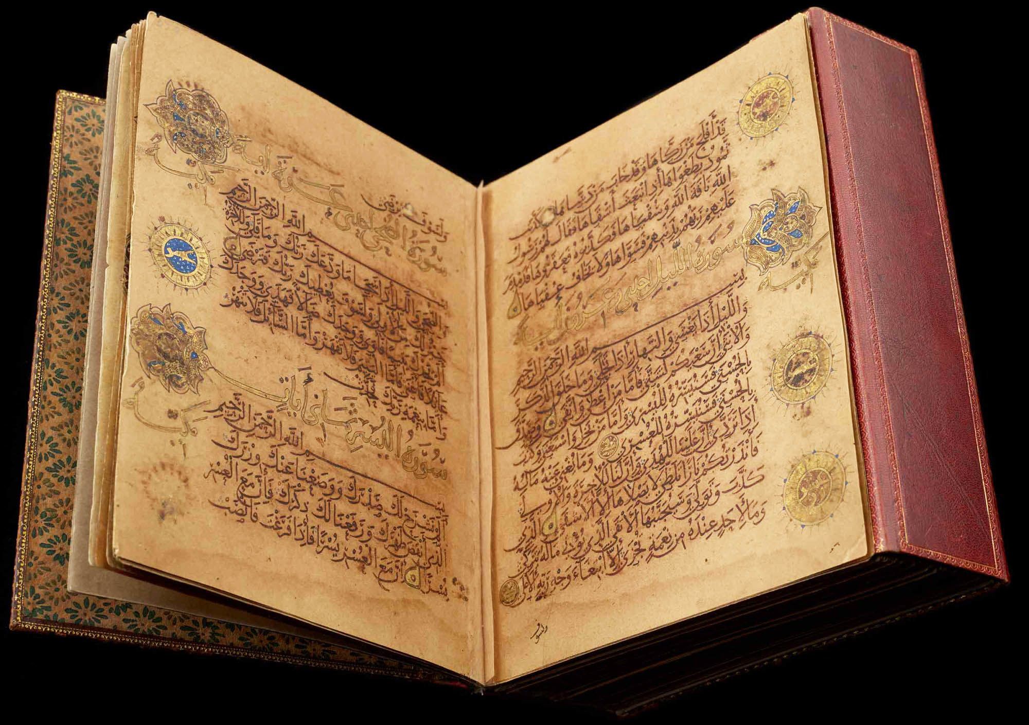
Ibn Al-Bawwab produced an estimated 64 copies of the Qur’an. This one, written in Naskh script, is housed at the Chester Beatty Library in Dublin. (Chester Beatty Library)
Ibn Al-Bawwab produced an estimated 64 copies of the Qur’an. This one, written in Naskh script, is housed at the Chester Beatty Library in Dublin. (Chester Beatty Library)
It was Ibn Al-Bawwab who took Ibn Muqla’s system of proportional scripts and artistically elevated them through the graceful use of rhythm and movement. “Despite the regularity of the letters, there is nothing dryly mechanical about them and that, surely, was the essence of Ibn Al-Bawwab’s stimulating contribution to the art of calligraphy,” wrote David Storm Rice in 1955. “He achieved a gracefully flowing script while preserving a systematized and proportioned alphabet. It looks easy to imitate and yet defied imitation.”
Al-Musta’simi, the last of the great medieval calligraphers, would further refine the Al-Aqlam Al-Sitta during the 13th century. Known as Sultan Al-Kuttab (Sultan of Calligraphers), he served as secretary to the last Abbasid caliph and survived the sacking of Baghdad by the Mongols in 1258. He replaced the straight-cut qalam (the calligrapher’s pen) with an oblique cut, resulting in a more refined and elegant script. Significantly, it was Al-Musta’simi who would act as the inspiration for calligraphers following the destruction of Baghdad and the bloody end of the Islamic Golden Age.
In the aftermath of the Mongols’ sacking of the Abbasid capital, the center of calligraphic excellence would eventually shift north to Istanbul. The Ottomans invented or perfected several styles, including Ruqʿah, with its straight lines and simple curves, and the intricate, heavily stylized Diwani script, developed for use in court documents to ensure confidentiality and prevent forgery.
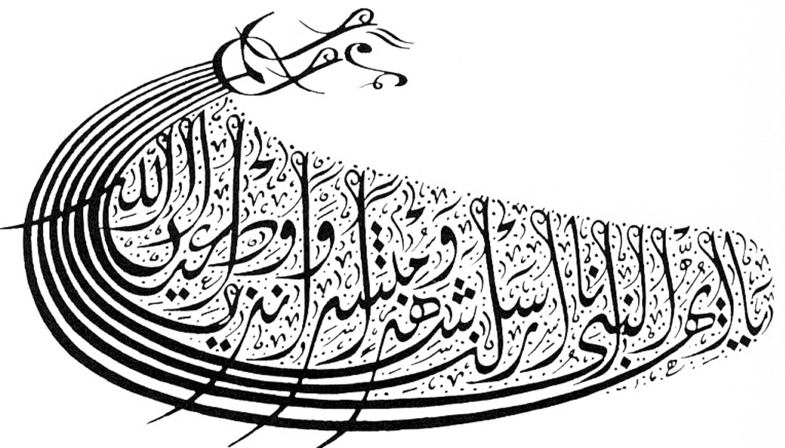
A 19th-century example of the intricate, heavily stylized Diwani script by Mehmet Izzet Al-Karkuki is shown here. (Alamy)
A 19th-century example of the intricate, heavily stylized Diwani script by Mehmet Izzet Al-Karkuki is shown here. (Alamy)
“It was said in the past that handwriting is emblematic of humanity itself, and when we see lines from the past, we can also see the nature of the calligrapher clearly in their writings,” says Massoudy. “For example, in the 15th- and 16th-century Ottoman state there were two great calligraphers whose work has reached us in the present day. The first is Sheikh Hamdullah, whose calligraphy was full of delicate and sweet feelings. The other is Ahmed Karahisari, who built complex letters, especially the letter ‘A’ (the aleph), which he drew tall like a lighthouse. A calligrapher therefore reveals himself by creating a closed, static and rigid piece of work, but another calligrapher can give the same letters new vigor, openness and vitality.”
Hamdullah was foremost amongst Turkish calligraphers and is considered the father of the Ottoman school. Inspired by the work of Al-Musta’simi, he refined the six standard scripts first codified by Ibn Muqla, perfected the Naskh and Thuluth scripts, and produced an estimated 47 copies of the Qur’an. His use of Naskh in particular turned that script into the most elegant and legible of all for transcription of the Qur’an.
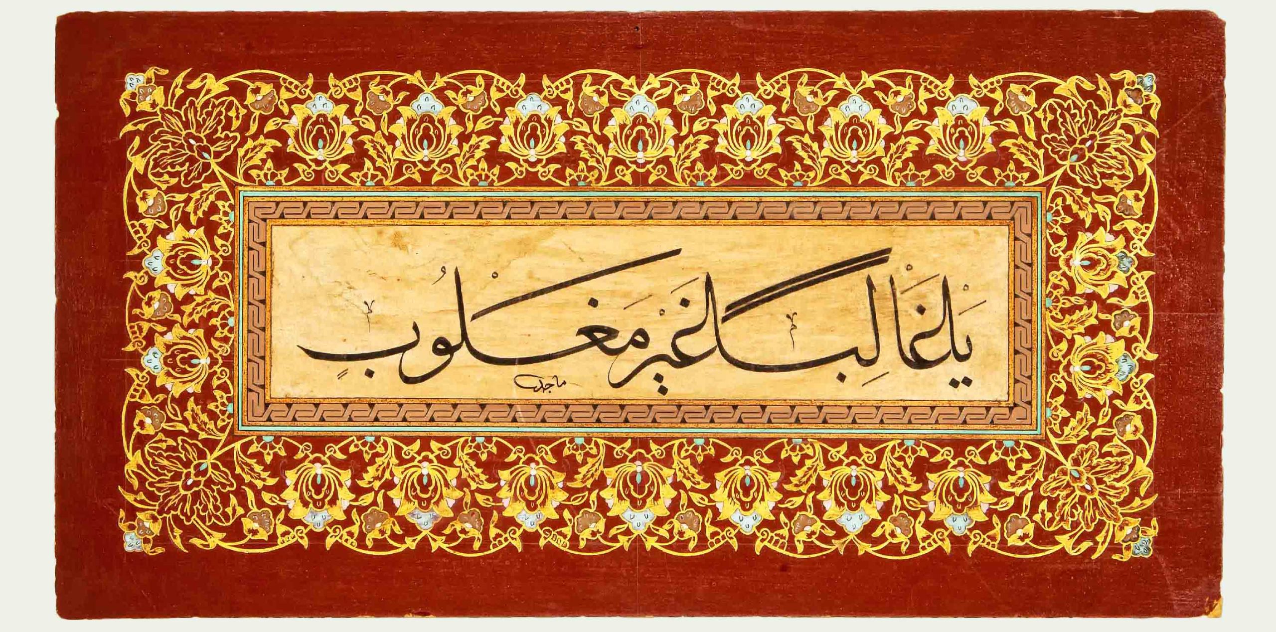
An undated example of Thuluth script. (Sharjah Museums Authority)
An undated example of Thuluth script. (Sharjah Museums Authority)
Also developed during this period was the Jali — or large — style of Thuluth and Diwani, an incredibly intricate style which can challenge even experienced calligraphers. “It has very distinctive characteristics and the more you study it, the more you discover,” says the Saudi-Iraqi artist and designer Majid Alyousef. “It reminds me of fractal drawings where you see more details appearing every time you zoom in. This characteristic made it more interesting to study and investigate, especially when I started studying design and abstraction.”
Carefully studying and investigating the art of calligraphy is important to artist Majid Alyousef, whose love of the written word began with a case of bad handwriting.
Significantly, the Ottomans categorized scripts by usage and created a system that determined which scripts would be used for certain functions based on their form. This meant that each script’s size, complexity and even harmonic proportions would decide their use. For example, the Tumar script was used for covenants, Ruqʿah was reserved for simple handwriting and correspondence, and Diwani Jali was utilized for formal short pieces such as invitations, certificates and religious quotations.
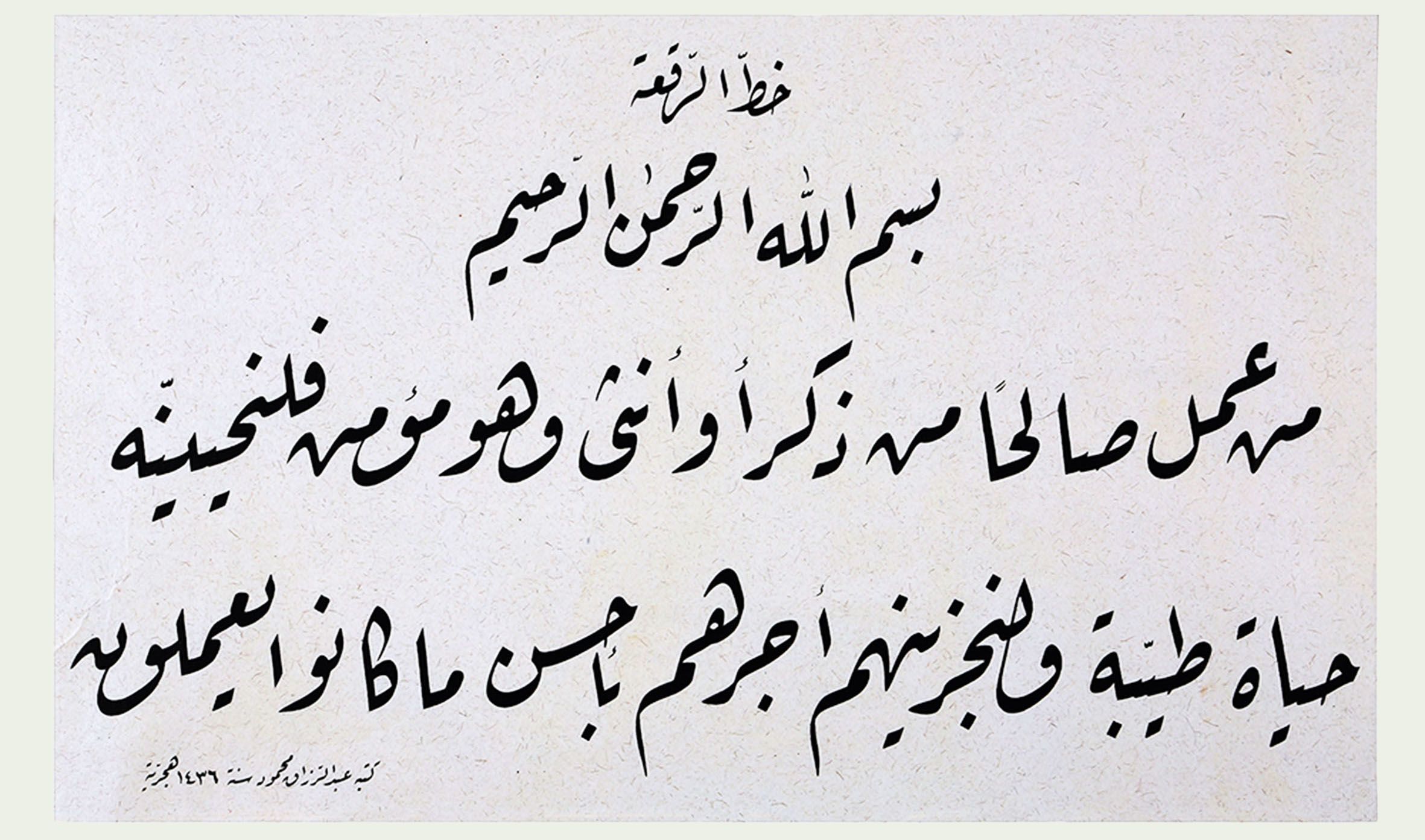
Ruqʿah was mainly reserved for simple handwriting and correspondence. (Sharjah Museums Authority)
Ruqʿah was mainly reserved for simple handwriting and correspondence. (Sharjah Museums Authority)
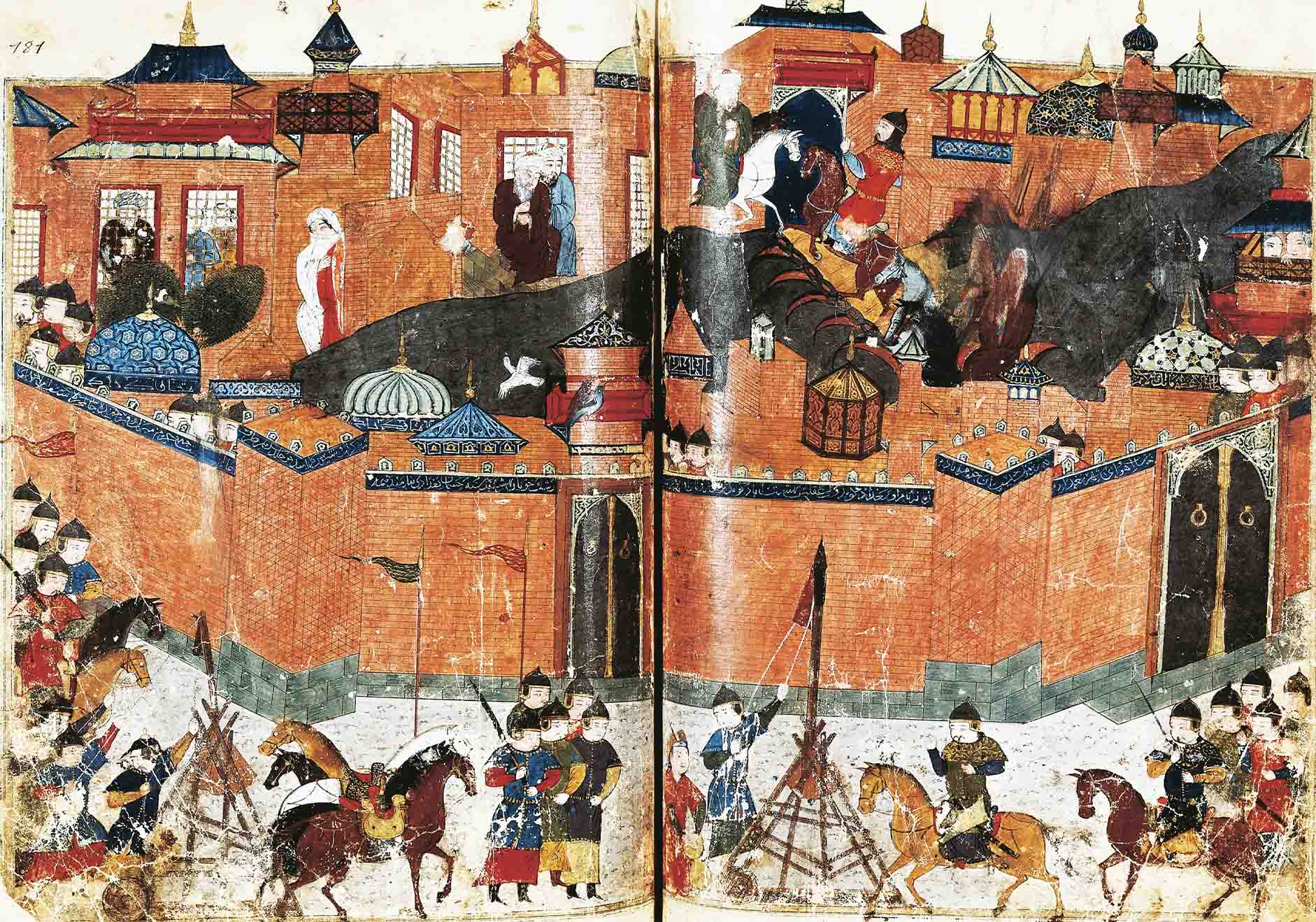
In the aftermath of the Mongols’ sacking of Baghdad in 1258, depicted here, the center of calligraphic excellence would eventually shift north. (Getty Images)
In the aftermath of the Mongols’ sacking of Baghdad in 1258, depicted here, the center of calligraphic excellence would eventually shift north. (Getty Images)
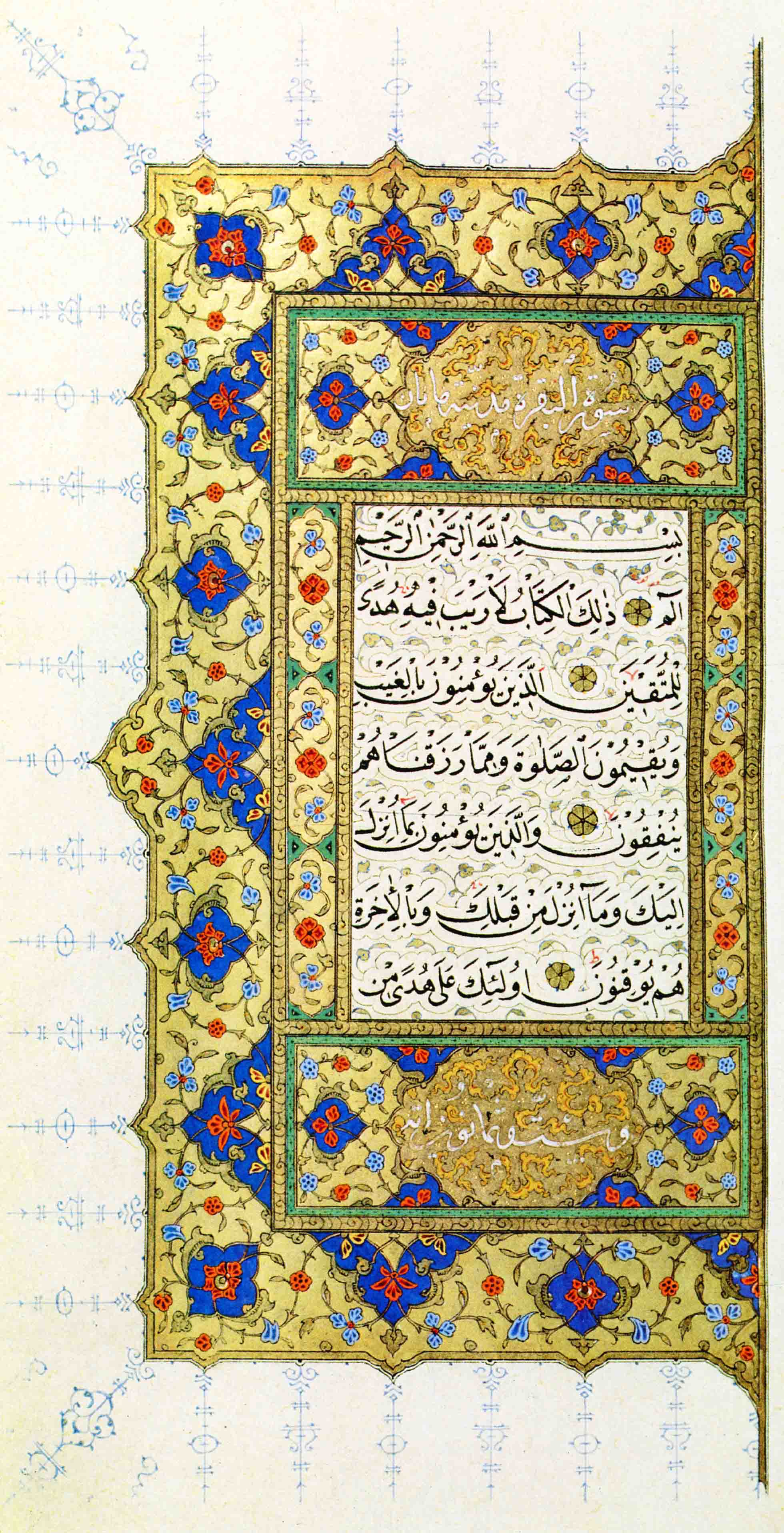
Sheikh Hamdullah, who worked between the 15th and 16th centuries, produced an estimated 47 copies of the Qur’an. (Alamy)
Sheikh Hamdullah, who worked between the 15th and 16th centuries, produced an estimated 47 copies of the Qur’an. (Alamy)
Calligraphy's many uses
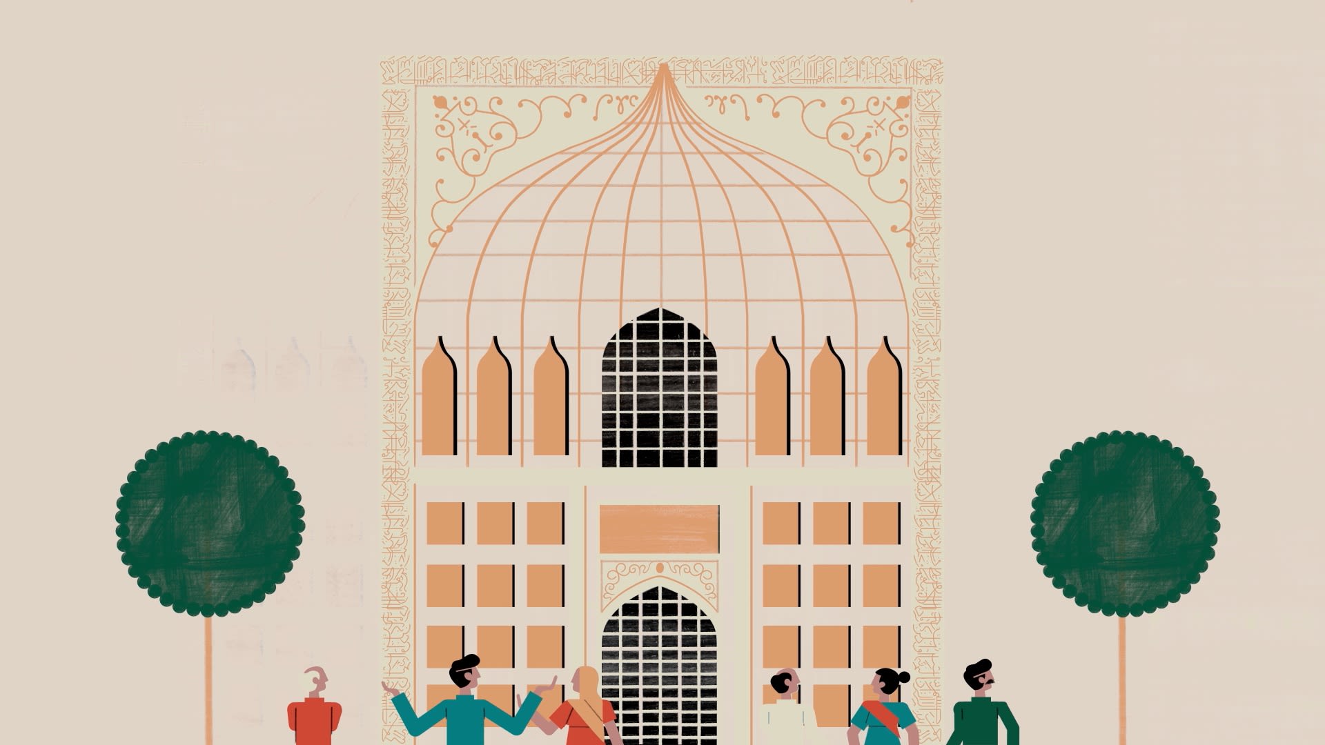
Although the development of Arabic calligraphy is strongly tied to the Qur’an, from the outset it was used for a variety of functions. It has adorned virtually every surface, has been embraced by a multitude of professions, and has been employed in innovative ways to create works of art based on individual letters or words. As such, it is an intrinsic part of both Arab and Islamic art.
Its most obvious manifestation — and the one we have been mostly concerned with so far — has been the written word on either parchment or paper. Yet even this had multiple uses and was in no way limited to Islamic texts. “Ancient bibles were also transcribed in Arabic script,” notes Lana Shamma, Art Jameel’s senior manager of public programs. “As a whole, this reverence for the written word also translated to a reverence for the Arabic language, which remains alive in present-day culture.”
The Ottomans may have categorized scripts by form and function, but the use of any given script was always determined by its audience, its artistic form, and the content of the writing itself. Naskh, for example, was a preferred script for manuscripts and administrative documents; Rayhani was used for chancellery letters and edicts; and the highly secretive Diwani was, as mentioned, used for court correspondence. In Persia, the Nastaliq script, which emerged during the 14th and 15th centuries, became the preferred style for poetic texts.
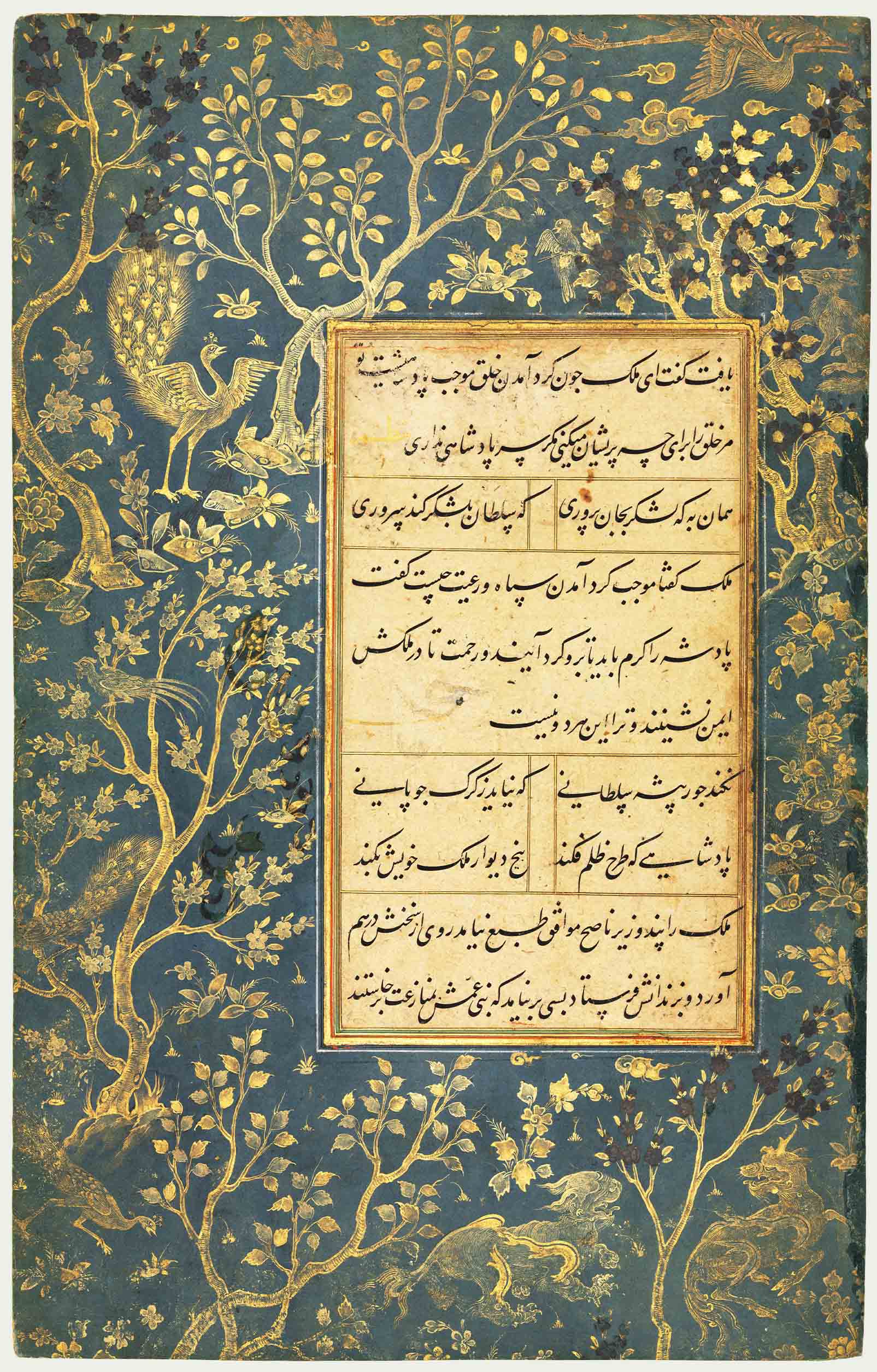
This collection of Persian prose is written is Nastaliq script and hails from circa 1475-1500. (Getty Images)
This collection of Persian prose is written is Nastaliq script and hails from circa 1475-1500. (Getty Images)
As with many forms of expression, however, the Arabic script also “lends itself to abstraction and to the breaking of ‘rules’ to create distinct styles,” says Shamma. “Its flexibility also makes it appealing for applications on multiple media, ranging from architecture to book illumination to embroidery on textiles.” As such, Arabic calligraphy can be found on everything from ceramics, textiles and enameled glass to coins, metalwork, carpets and woodcarvings.
Styles of floriated Kufic were developed to adorn ceramics in the Fatimid era; inscribed textiles known as tiraz were embroidered with the names of Caliphs and bestowed as gifts; and mirrors cast in bronze were engraved with good wishes. Calligraphers would often create works of exquisite beauty and sometimes staggering complexity, exploiting Arabic’s versatility and its potential as an ornamental form.
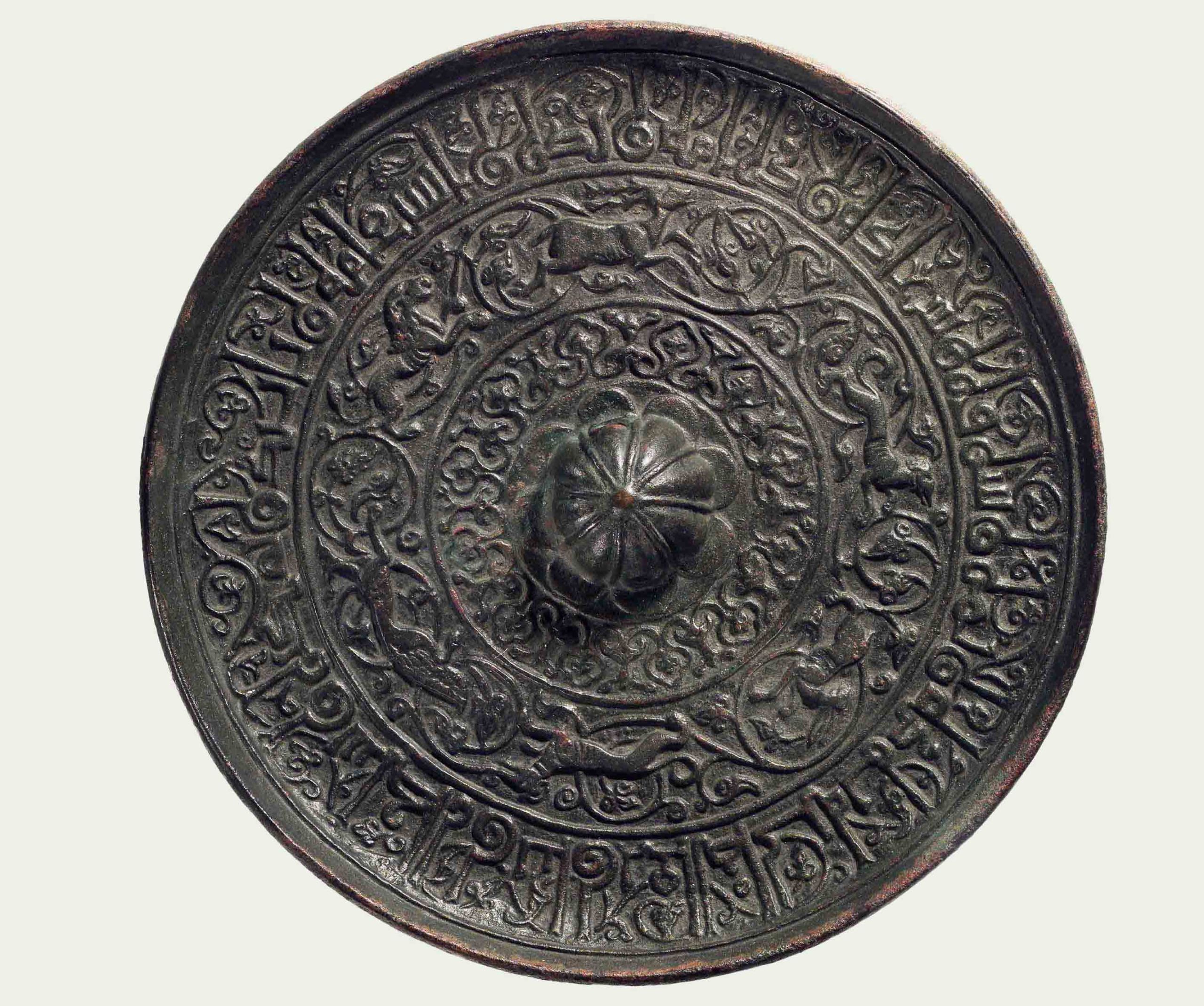
This 12th-century mirror cast in bronze features foliated Kufic good wishes on the outer rim. (Alamy)
This 12th-century mirror cast in bronze features foliated Kufic good wishes on the outer rim. (Alamy)
Certain scripts — particularly Kufic and Thuluth — also lent themselves to architecture. Calligraphic inscriptions adorn a variety of religious, military and civic buildings and, in many cases, were monumental in stature. As mentioned previously, one of the earliest known examples of architectural inscription can be found in Jerusalem’s Dome of the Rock, but inscriptions are prevalent within buildings across the Islamic world. They adorn the Sultan Hassan Mosque in Cairo, one of the finest examples of early Mamluk architecture; the Bou Inania Madrasa in Meknes, Morocco; and the Shah Mosque in Isfahan, considered a masterpiece of Persian architecture.
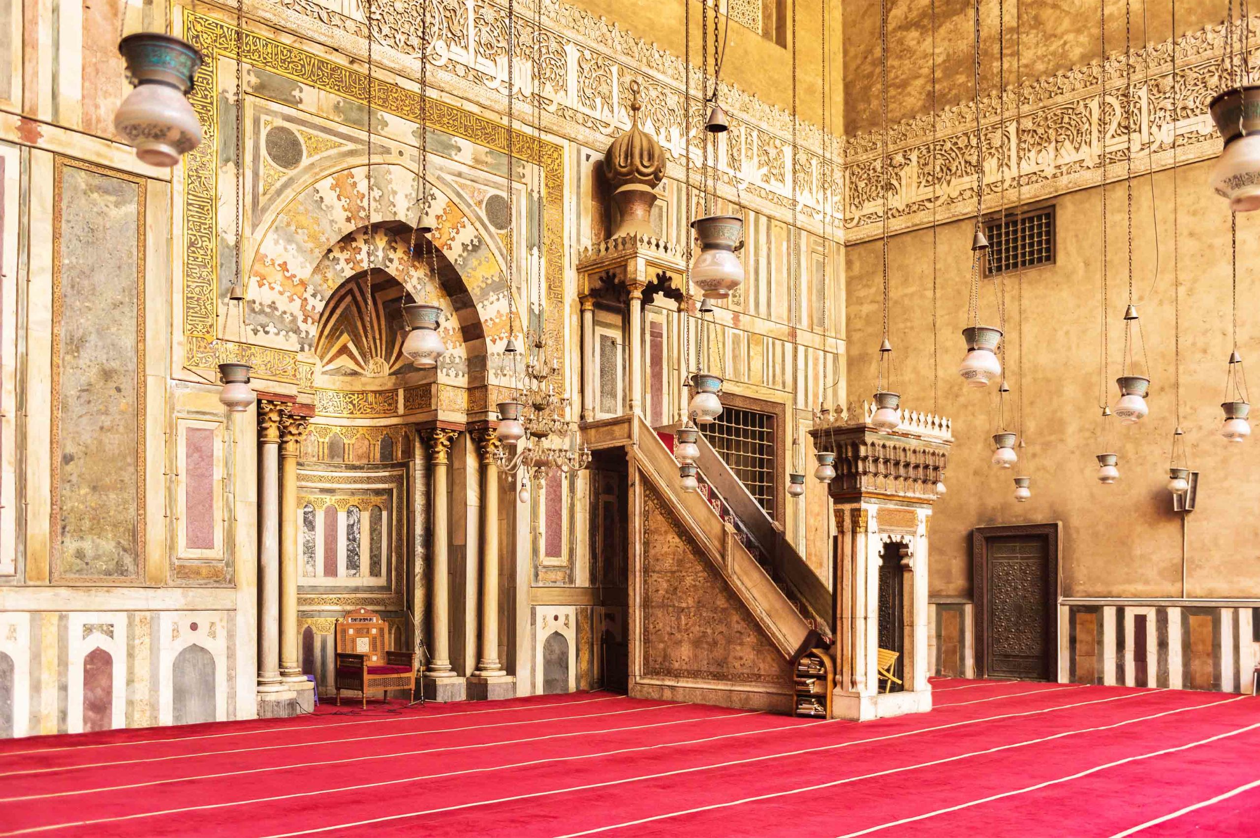
Calligraphy adorns the Sultan Hassan Mosque in Cairo, one of the finest examples of early Mamluk architecture. (Shutterstock)
Calligraphy adorns the Sultan Hassan Mosque in Cairo, one of the finest examples of early Mamluk architecture. (Shutterstock)
AUC’s Shehab believes calligraphy had three main architectural roles: “The first one was informative, because buildings usually stated who the patron was, when the building was constructed, and the name of the building. If there was a waqf (a charitable endowment) for the building it was also either engraved or painted inside the building.
“The second one was decorative. Because zoomorphic and human representations were not accepted in religious spaces, calligraphy and geometric motifs, which we call Arabesque, were key to decorating internal spaces,” she continues.
“And I think the third idea is a manifestation of power. When you have these large, beautiful scribed paintings in a mosque in Turkey, or on a facade in Mamluk Egypt, or on a Safavid building in Iran or in Mughal India, this beautiful calligraphy is a manifestation of piety but also of power — of respect for God. Because when you stand in front of something so beautiful you are in awe.”
This beautiful calligraphy is a manifestation of piety but also of power — of respect for God.
In the Bibi-Khanym Mosque in Samarkand and the Mausoleum of Qalawun in Cairo, it is the bricks and tiles that form the text using geometric Square Kufic. Referred to as Banna’i in Farsi, this style of decorative brickwork may have originated in Syria and Iraq but arguably found its greatest expression in Iran and Central Asia. In the Mausoleum of Khoja Ahmed Yasawi in Kazakhstan, for example, blue brickwork spells out the names of Allah and of the Prophet Muhammad, while raised brickwork in both Kufic and Naskh can be found on the Minaret of Saveh in Iran.
Calligraphers were also at the heart of the age of discovery encouraged by the Abbasid caliphs of Baghdad. Astronomers, physicians, mathematicians and cartographers may have expanded Arab and Muslim knowledge, acting as a bridge of learning between Ancient Greece and the European Renaissance, but it was calligraphers who helped record that knowledge. Calligraphers such as the 10th-century bibliographer Ibn Al-Nadim, whose “Kitab Al-Fihrist” is an index of all the books written in Arabic at the time of its publication. Hence calligraphers played a role in “preserving human knowledge and history,” says Alyousef, just as calligraphy itself acted as a “symbol of uniqueness and a signature of identity.” Something that it continues to do today.
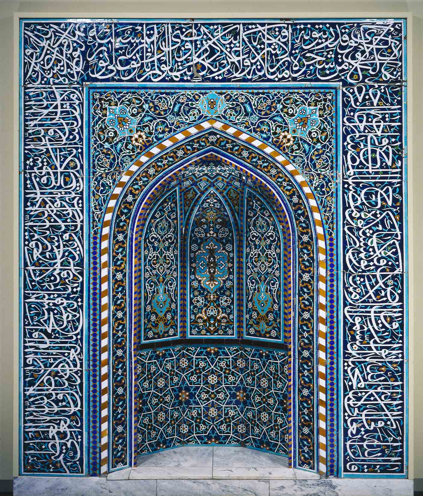
Aside from paper and parchment, Arabic calligraphy can be found on ceramics, pictured here, textiles, metalwork, carpets and more. (Shutterstock)
Aside from paper and parchment, Arabic calligraphy can be found on ceramics, pictured here, textiles, metalwork, carpets and more. (Shutterstock)
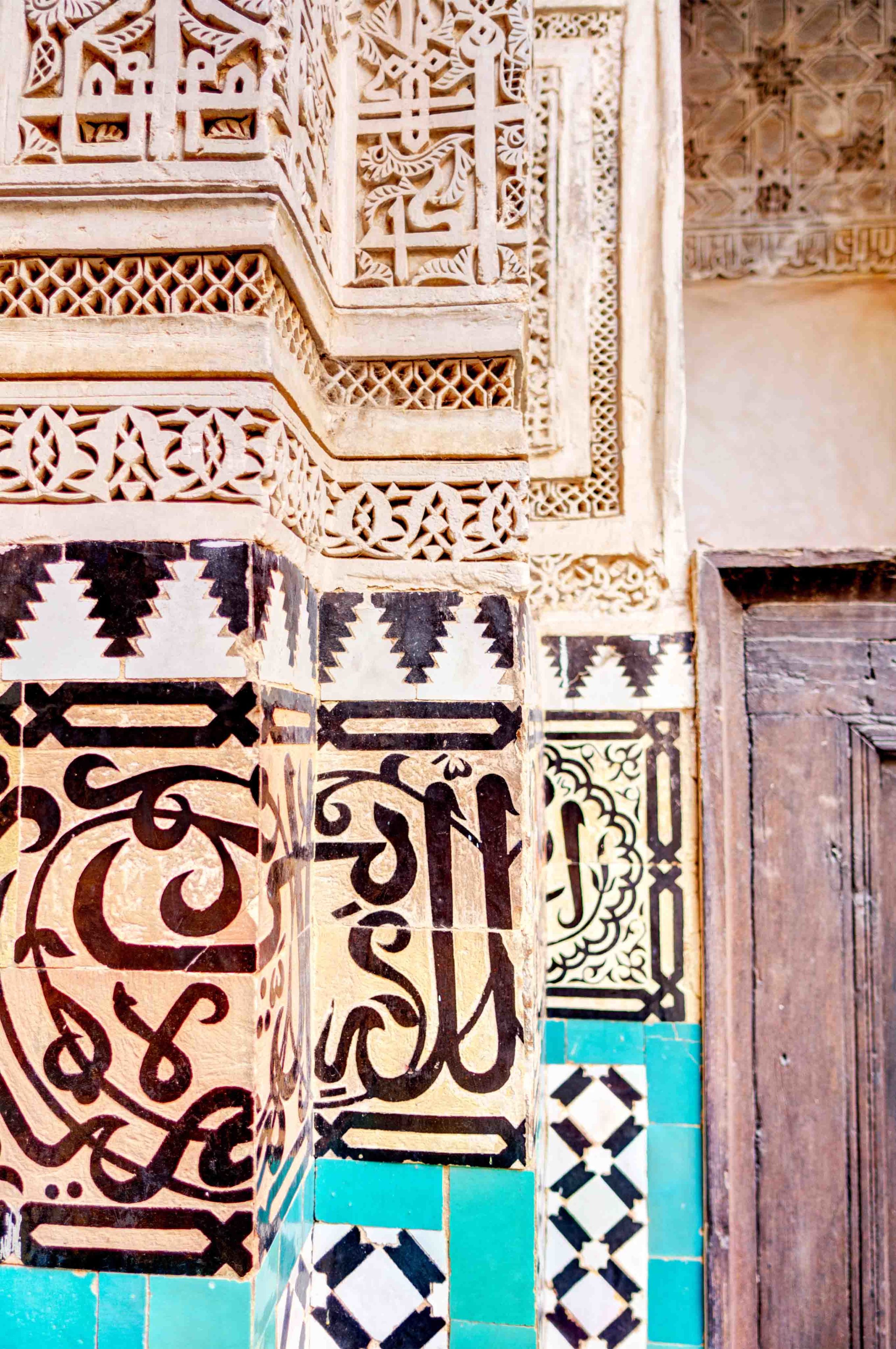
A close up of the calligraphy-adorned walls in the Bou Inania Madrasa in Meknes, Morocco. (Shutterstock)
A close up of the calligraphy-adorned walls in the Bou Inania Madrasa in Meknes, Morocco. (Shutterstock)
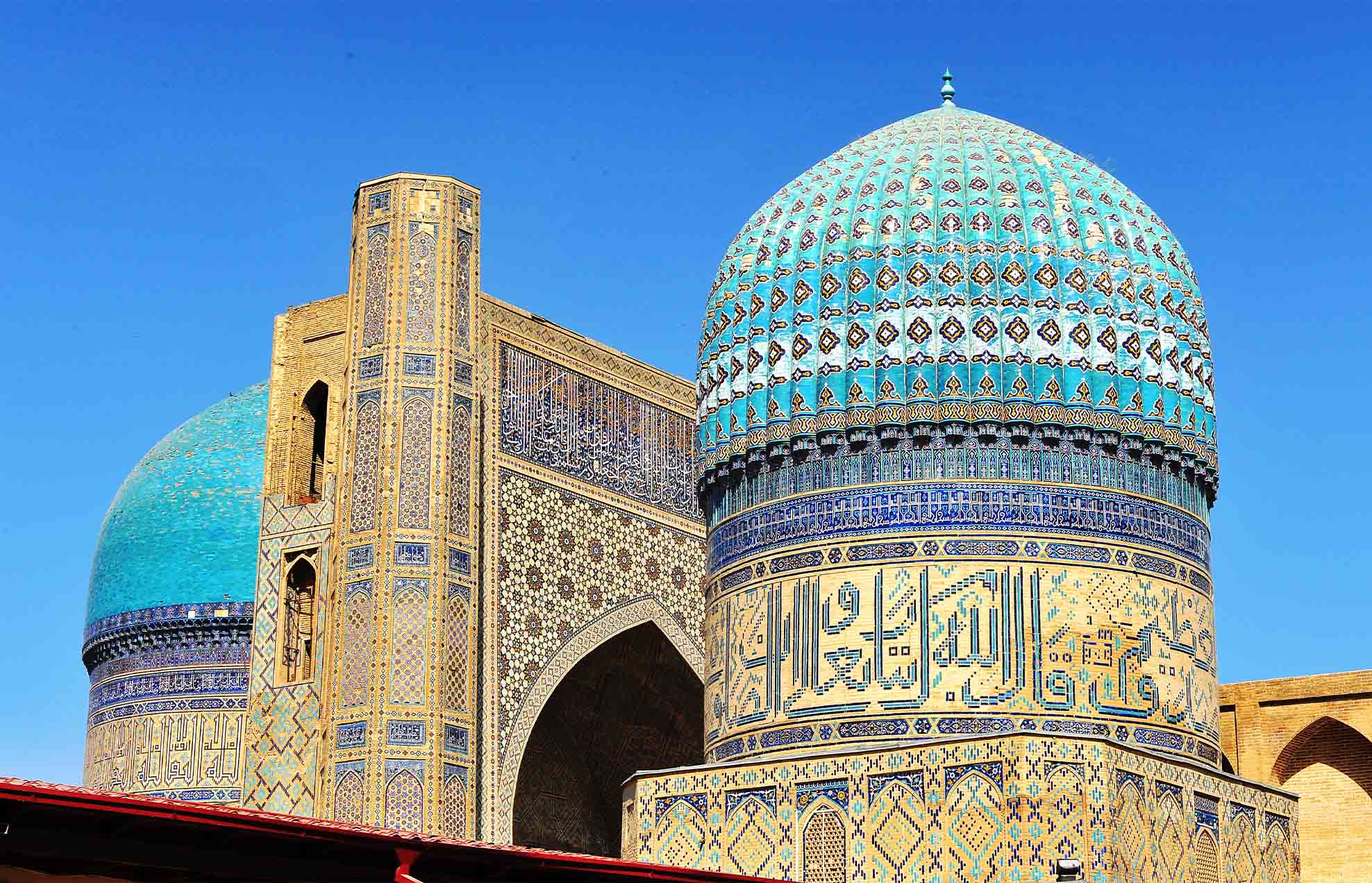
In the Bibi-Khanym Mosque in Samarkand, it is the bricks and tiles that form the text using geometric Kufic. (Shutterstock)
In the Bibi-Khanym Mosque in Samarkand, it is the bricks and tiles that form the text using geometric Kufic. (Shutterstock)
A calligrapher’s
toolkit
“I’ve been doing calligraphy for 35 years and I’m still practicing,” says Shawkat. “I practice daily. It’s like music. The more you practice, the more your letters mature.”
Artist Wissam Shawkat explains why he believes artists should constantly innovate.
As with all forms of art, calligraphy is as much about patience, practice and passion as it is about inherent skill. That means years spent with pen, ink and paper, mastering an art form that is cherished for its beauty, clarity and harmony. Traditionally, that would have meant being taught by a master calligrapher, who would have set at least one day aside each week to correct students’ calligraphic studies. This tradition continues today, although the early 20th century saw the establishment of calligraphy schools including the Madrasat Tahsin Al-Khotoout, the Khalil Agha School in Cairo, the Medresetul Hattatin in Istanbul and the Dar Al-Qalam Complex in Madinah.
We visit the Dar Al-Qalam Complex in Madinah to find out more about how students are embracing the art of calligraphy.
One former attendee of the Madrasat Tahsin Al-Khotoout was Massoudy, who spent a short period of time there in 1980. “The encounters between great calligraphers and amateurs made my time there feel longer than it was,” he recalls. “I had a similar feeling when I went to the capital of Ottoman calligraphy, Istanbul. I met the last great Ottoman calligraphers, such as Hamid Aytaç, who created calligraphy for me that I cherish. Despite spending less than a month on that trip, it felt as if I had been studying and learning there for many years. Truth be told, I had hundreds of questions that I had not found answers for. And my trip to Turkey gave me the answers to most of them.”
For most modern calligraphers their first introduction to the art of calligraphy was at primary school. It was there that the Lebanese artist and poet Samir Sayegh first used ‘forbidden’ ink and was praised for the beauty of his handwriting. It was at school in Najaf that Massoudy, too, was applauded for his calligraphy, before moving to Baghdad as an apprentice and spending his days “practicing from morning until night.”
“Sometimes I’d have a meeting or encounter that broadened time,” he remembers. “An hour with the calligrapher Hashem Al-Baghdadi (considered the last of the classical calligraphers) felt like a full year to me. On a day when he would draw words for me I would feel that I had grown bigger.”
Al-Salem describes the rigorous training and dedication it takes to even begin to master the art form: “I studied calligraphy near the Holy Mosque in Makkah. I had a calligraphy mentor and teacher and I studied during summer vacation and three times a week… I would go after Fajr prayer and spend all day there studying and learning — I was 13 years old,” he says.
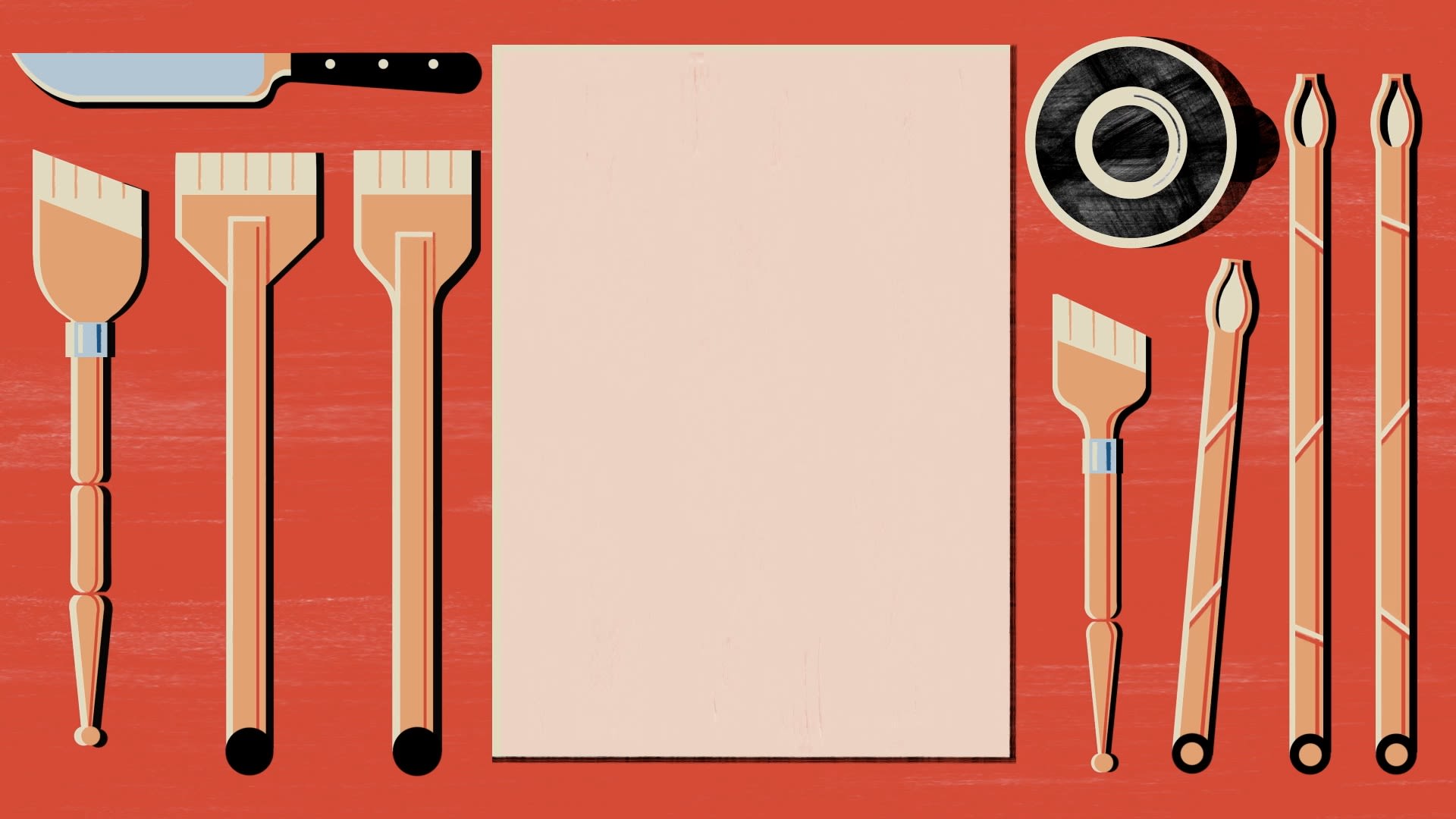
He, like the majority of calligraphers, relies on essential tools that have not changed much throughout history — the reed pen (qalam), a selection of knives (for cutting the reed or bamboo), various inks (traditionally made of soot dissolved in water and Arabic gum), and the parchment or paper on which to write.
Reed pens were chosen because they combined hardness and softness, solidity and flexibility, and allowed for an easy flow of ink to the surface of the paper. Various accessories, such as pen boxes and inkwells, would adorn a calligrapher’s desk, while calligraphy carried out on other materials, such as metal or wood, would require a selection of carving tools.
In traditional calligraphy books, tens of pages describe the reed pen and the manner in which it is cut, slit, dried and preserved.
“In traditional calligraphy books, tens of pages describe the reed pen and the manner in which it is cut, slit, dried and preserved,” says Sayegh, whose Beirut studio is filled with inkwells, pliers, end cutters, a hacksaw, two wooden mallets and an old hand-operated drill. “Tens of pages, too, describe the knife that the calligrapher should use in making the reed. Many other pages describe inks and how to produce and prepare them.”
In the “Subh Al-A‘sha,” an encyclopedia written by the Egyptian polymath Al-Qalqashandi in the early years of the 15th century, there are hundreds of pages on pens, knives, inks and other technical issues that the calligrapher needs to practice in order to master the art of calligraphy. The nib of the reed pen, for example, should be cut at an inclined angle and then slit in the middle to facilitate the flow of ink. The angle of the inclined cut depends on the intended script, while the type of reed used is largely down to personal preference.
“Cutting the pen at an inclined angle brings together both sides of the pen, thus helping the hand in smoothing its rotation with the pen and enabling the calligrapher to unite between two parallel lines,” explains Sayegh. “The inclination helps to make one side of the pen like a dot where the left and right sides meet every time the letter reaches its end or meets another letter. This design is one of the secrets of the art of calligraphy and makes it a witness to the hidden order of the universe.”
Although the pens used by calligraphers evolved over time — particularly following the development of scripts such as Diwani, Diwani Jali and Ruqʿah — they were essentially variations on the original qalam. “It is interesting to note that this evolution was the result of the prevalence of the utilitarian side of calligraphy over its aesthetic side,” adds Sayegh. “Pens that prioritized writing and conveying the linguistic content did not seek more creativity as much as they sought solutions that balance beauty and utility, such as the Naskh, Taliq and Ruqʿah scripts.”
The same pens are still in use today. Shawkat uses traditional styles such as the Khamish, Handam and Java, as well as modern pens such as the Tomar, which is made from a large slice of bamboo or wood. He also uses Pilot Parallels that have been modified for the Arabic language and different brands of fountain pen with modded nibs, such as Pelikan and Osmiroid. Sayegh, whose art is based on individual letters or words, has seen the pens he uses grow in size, yet the essence of their design has been preserved.
The paper used today tends to be handmade in countries including Nepal, India and Japan, but early calligraphers wrote on parchment made of sheep or deer skin. Such parchment was used for writing letters, official documents and religious texts and continued to be produced until the 11th century. The arrival of paper from China in the 8th century, however, led to the creation of the first paper factories in Samarkand and eventually to the production of paper in Baghdad, Damascus and Cairo.
However, paper posed two problems for calligraphers. Firstly, it was absorbent. Secondly, it tended to be rougher than parchment and was not smooth enough to allow the pen and the ink to flow well. These problems were overcome with the application of coatings, which gave the paper a glossier finish once dry. Such paper is often called Ahar, or Muqahar.
“For the calligrapher, paper has to abandon its own presence in order to reveal calligraphy’s full appearance,” says Sayegh. “Paper in relation to calligraphy is like a mirror in relation to the face — the cleaner and the more neutral it is, the clearer the face appears. Paper has to withdraw in order for calligraphy to fill the place.
“We strive today to understand the meaning of absence, withdrawal, cleanliness, neutrality and clarity,” he adds. “And according to our different understanding of the terms and our different intentions of use, materials that will carry the calligraphy will also change.”
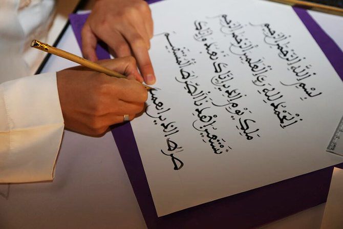
A student practices calligraphy using a traditional reed pen at the Dar Al-Qalam Complex in Saudi Arabia. (Arab News)
A student practices calligraphy using a traditional reed pen at the Dar Al-Qalam Complex in Saudi Arabia. (Arab News)
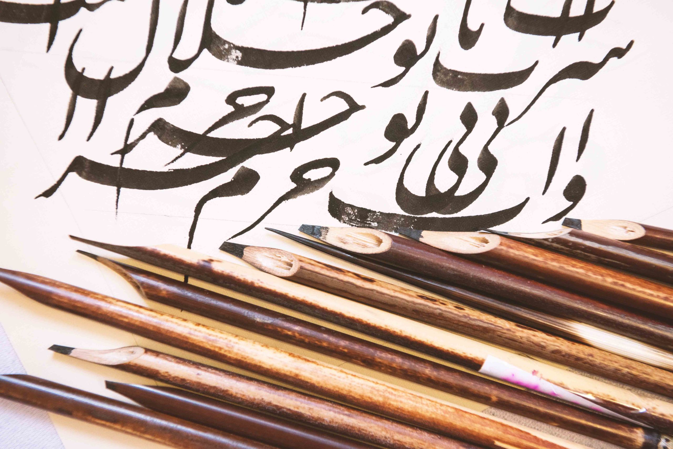
Reed pens combine hardness and softness, solidity and flexibility. (Shutterstock)
Reed pens combine hardness and softness, solidity and flexibility. (Shutterstock)
Turning the page
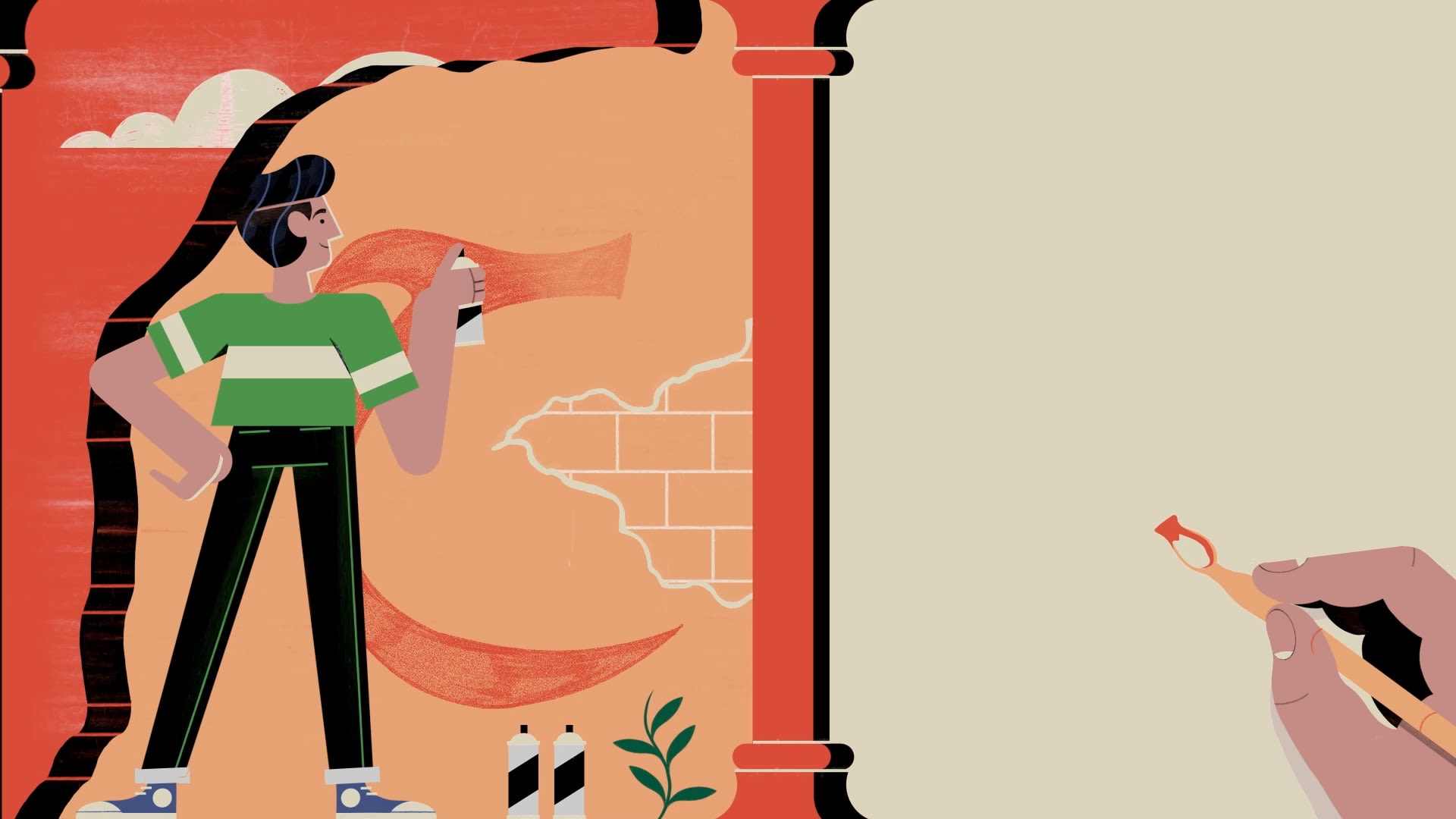
Any discussion of calligraphy’s role in the modern world cannot be limited to calligraphy itself. It must encompass the entirety of its legacy, from art and typography to design and branding.
As Shamma says, calligraphy is the foundation of typography, which has had a profound impact on the development of graphic design. “This is apparent in the way typography has evolved as an art form in itself,” she says. “You also see Arabic calligraphy transcending pen and paper in the form of calligraffiti, with artists such as eL Seed combining street art with calligraphy and covering building facades to highlight architecture and often times unite communities around the messages depicted.”
French-Tunisian artist eL Seed merges a variety of influences. Here, he talks to us about his groundbreaking approach from his studio in Dubai.
Another example is the intricate work of Saudi artist Lulwah Al-Homoud, who incorporates Arabic letters to create complex abstract works on paper, synthesizing characteristic motifs from Islam with the rhythms found in calligraphy and geometry to transform them into a new visual vocabulary, thereby breaking the mold in her own way.
Born in 1967 in Riyadh, Al-Homoud now lives and works between Dubai and London and seeks to incorporate calligraphy in her abstract work in a manner that departs from the art form’s original use. “The way I use my compositions of letters and words is unconventional,” she says. “The way I use calligraphy is not meant to be read. It will ask people to look more deeply into the painting to be able to figure out what is written. It is not direct. There’s a visual ambiguity to my work. I deconstruct the words in my work and then rebuild them.”
Saudi artist Lulwah Al-Homoud incorporates Arabic letters to create complex abstract works and spoke to us about her creative process.
Yet the trend toward a realignment around art and design, combined with the predominance of printing and the digitization of the Arabic script, has had a considerable impact on traditional calligraphy. In Egypt, a country still considered to be a calligraphic hub, institutes such as the Khalil Agha School are struggling to survive following the removal of state funding, while calligraphy’s popularity across the wider Arab world has declined. Both the Madrasat Tahsin Al-Khotoout in Cairo and the Medresetul Hattatin in Istanbul have long since closed. In turn, the demand for calligraphers has itself diminished. “It is said that in the 19th century there were around 1,500 calligraphers in Istanbul,” says Massoudy. “And when the printing press was introduced they protested with a coffin that had their pens in it.”
“The traditional practice of calligraphy has suffered from a decline since the invention of the printing press,” adds Alyousef, who works in the fields of creative design, typography and calligraphy. “As time goes by and technology advances, the need for a calligrapher who writes books is extremely rare. But the rich heritage and aesthetic values of calligraphy make it very valuable in abstract art, architecture, design and other similar fields. That’s why I think the best way to keep and even advance the teaching of calligraphy comes through a deeper study of design, form and abstraction.”
In Arabic typography, designers are creating groundbreaking work inspired by calligraphic forms to create fonts that reflect the world we live in. In doing so, they are finding “solutions to issues of legibility and aesthetics and creating fonts that are truly unique, proportionate and functional,” says Basma Hamdy, an Egyptian designer, educator and the author of “Khatt: Egypt’s Calligraphic Landscape.”
In the realm of art, Sayegh has ignored the calligraphic rules established by Ibn Muqla, stylizing both the geometric and cursive variations of Arabic calligraphy to create a universally appreciable practice based on form and beauty. For his geometric work, that has meant a focus on equilibrium and a dialogue between line and space. For the more free-flowing pieces, it has meant a system based on movement and balance. He has concentrated on freeing calligraphy from the constraints of language.
Massoudy, too, has taken individual letters, words and phrases and created vibrant works of art that, despite their break with tradition, continue to express the beauty of Arabic calligraphy. Both artists are considered to be part of the movement known as “Hurufiyya,” which combines tradition with modernity to create a culturally specific visual language.
The desire to bring calligraphy into the modern age is echoed by Saudi artist Al-Salem, who “began questioning how I could make my calligraphy become a contemporary art form.”
Al-Salem is known for his recontextualization of calligraphy in mixed-media formats. He uses neon tube lights, concrete blocks and laser-cut stainless steel to create new forms of calligraphy that defy convention.
“I began as a classical calligrapher,” he explains. But having traveled abroad, he says he realized “I wanted it to co-exist within the realm of contemporary art. I was asking myself the question that most calligraphers today ask themselves: How can we evolve from such an ancient and traditional art form?”
Saudi artist Nasser Al-Salem speaks to us about his approach to the art of the written word, particularly his love of mixed media formats.
In their own way, street artists such as eL Seed and Yazan Halwani, who merge Arabic calligraphy with graffiti art, have also helped to breath new and visually intriguing life into scripts such as Kufic, Diwani and Thuluth. Halwani in particular, with his focus on cultural icons and the writings of poets including Mahmoud Darwish, has contributed towards the Arabic script’s continued role as an integral part of Arab and Islamic identity.
“As long as Arabic is a spoken language, Arabic text continues to be the visual language that accompanies it,” says Art Jameel’s Shamma. “The application of calligraphy in innovative ways using different media and conceptual research is evidence of its influence in current practices.”
Shamma cites the Iraqi artist Mehdi Moutashar, who used Arabic script as the inspiration for his work “Two Folds at 120 Degrees,” and Shehab’s “A Thousand Times No,” which featured 1,000 different versions of the word ‘la.’ The latter was first exhibited on a plexiglass curtain measuring 3.5m by 7m in 2010. Shehab also compiled her research into a book, which placed each depiction of the word ‘la’ chronologically, stating the place she had found it, the medium used, and the patron who had commissioned the work. “I’m inspired by history to comment on the current state of affairs,” she says. “For me, calligraphy is a manifestation of identity.”
Shehab has also founded Type Lab within AUC to document the varying forms of Arabic lettering. So far the lab has documented almost 70,000, with the goal of helping designers create solutions for the future. “The future lies with the youth who are supposed to design a new Arab identity,” she says. “Once they understand their history they will be able to design their future.”
Not everyone has embraced this brave new world. Many traditionalists believe that proportion and form in calligraphy should be adhered to, not discarded with nonchalance. And while many believe there is room for modernization and the development of new scripts, others defend classical tradition. Others question whether movements such as calligraffiti, which has no rules and requires no formal training, should even be talked about in the same breath as calligraphy.
“I say to those who refuse to look at new currents and new methods in Arabic calligraphy: If we had applied such an idea to calligraphy for the previous 1,000 years, we would still only be using Kufic,” says Massoudy. “What we see today are the styles that have been created by innovators from every era. Perhaps, in their time, these innovative new methods of calligraphy were met with similar doubts. However, these styles have become part of our history and have been placed in glass boxes and kept in safe places such as museums, where we preserve them as we preserve everything that is morally and materially valuable. Therefore, every rejection of artistic or literary production is nothing but a contribution to the impoverishment of society.”
What we see today are the styles that have been created by innovators from every era.
None of which means traditional Arabic calligraphy is in terminal decline. Far from it, in fact. Spurred on by exhibitions, workshops, talks and prizes, especially in the UAE and Saudi Arabia, it is once again being celebrated in all its forms. Nowhere more so than in the Saudi Ministry of Culture’s Year of Arabic Calligraphy.
“There is a big place for calligraphy in our modern world. With ever-evolving technologies, I see a future world where calligraphy and the formal beauty of the script become an important, if not a necessary, component of our everyday experiences. I believe we adapt to what we are served or presented with,” says Hamdy. “Why can’t we imagine a world where calligraphic beauty becomes a necessity for communication? Where wonder is embedded in the simplest acts of reading and deciphering?”
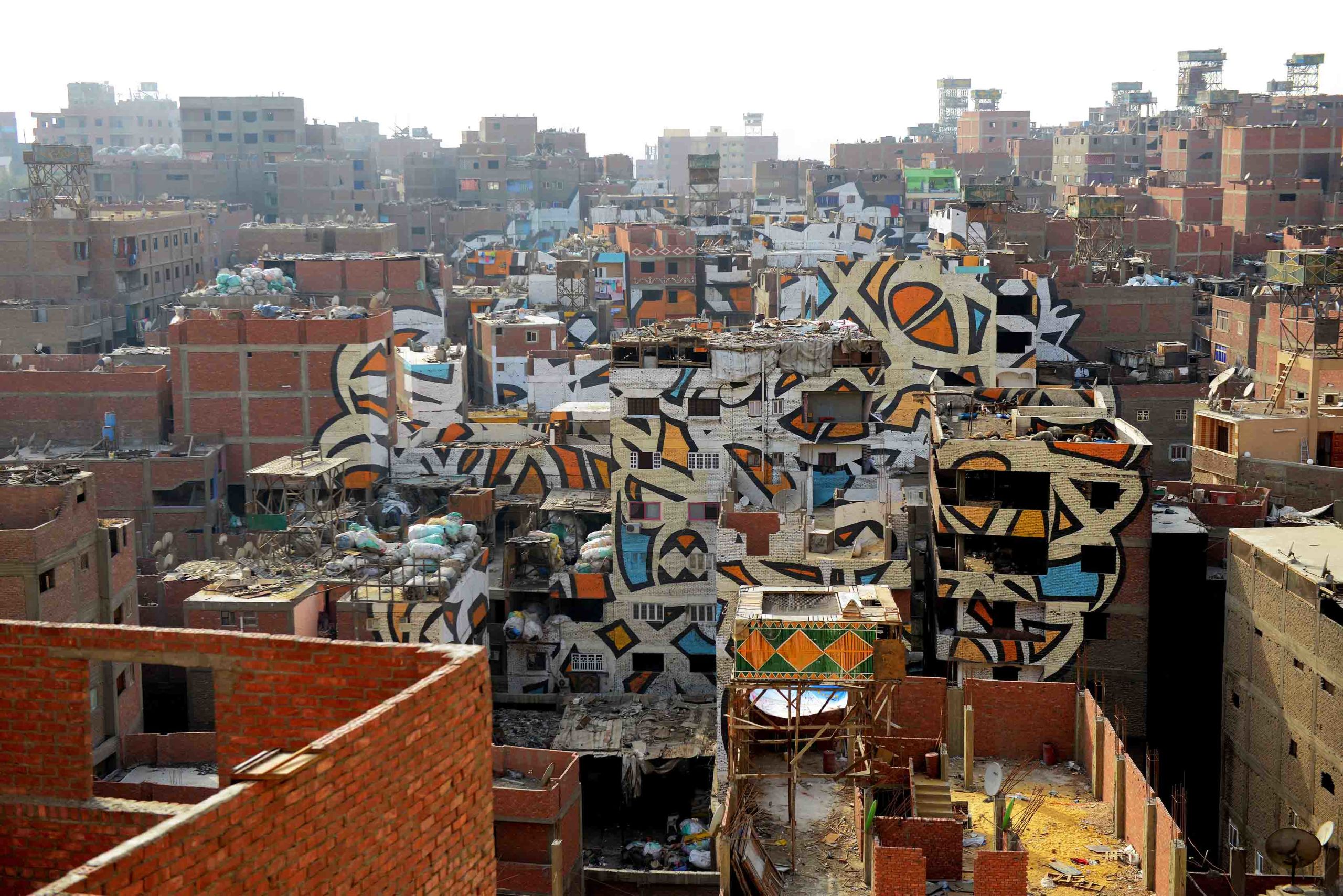
French-Tunisian artist eL Seed is part of a new wave of calligraphy-focused artists. He has created works across the world, including ‘Perception’ in Cairo, pictured here. (Supplied)
French-Tunisian artist eL Seed is part of a new wave of calligraphy-focused artists. He has created works across the world, including ‘Perception’ in Cairo, pictured here. (Supplied)
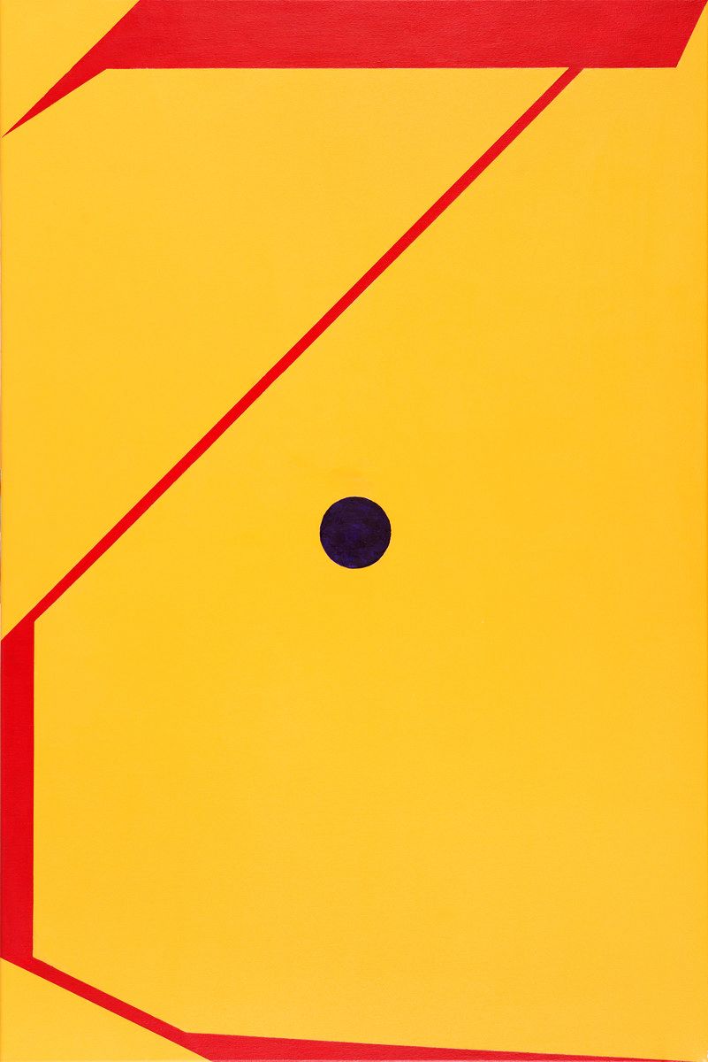
Lebanese artist Samir Sayegh has ignored the calligraphic rules established by Ibn Muqla, stylizing both the geometric and cursive variations of Arabic calligraphy. (Supplied)
Lebanese artist Samir Sayegh has ignored the calligraphic rules established by Ibn Muqla, stylizing both the geometric and cursive variations of Arabic calligraphy. (Supplied)
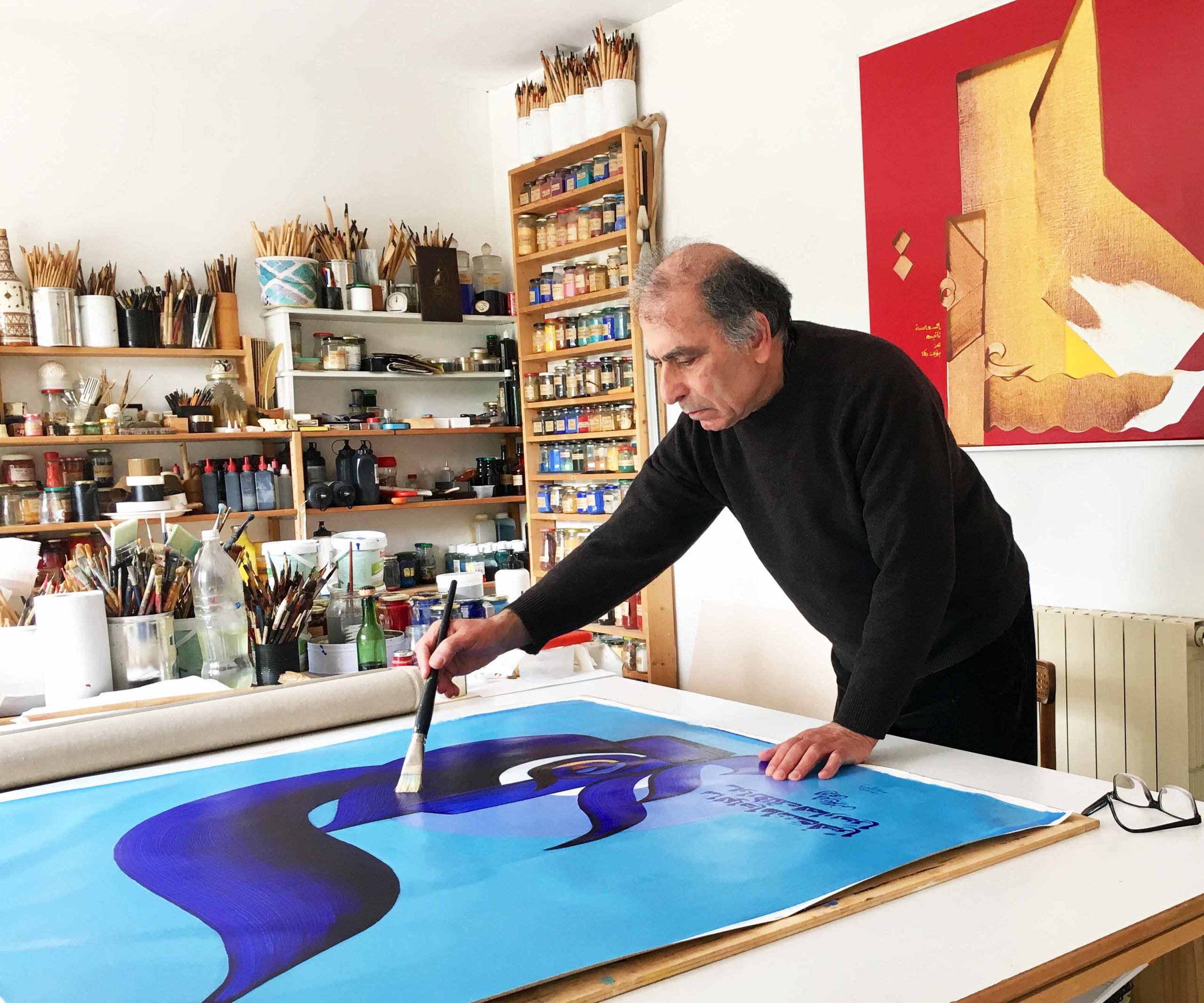
Hassan Massoudy has taken individual letters, words and phrases and created vibrant works of art. (Supplied)
Hassan Massoudy has taken individual letters, words and phrases and created vibrant works of art. (Supplied)
Credits
Editors: Saffiya Ansari, Mo Gannon
Creative director: Simon Khalil
Graphics: Douglas Okasaki
Designer: Omar Nashashibi
Video producer: Eugene Harnan
Video editors: Ali Noori, Farah Heiba
Animation: Wild Studio
Picture researcher: Sheila Mayo
Editorial researcher: Rebecca Anne Proctor
Copy editor: Adam Grundey
Social media: Mohammed Qenan Al-Ghamdi, Hams Saleh, One Carlo Diaz
Producer: Arkan Aladnani
Editor-in-chief: Faisal J. Abbas
Special thanks: Taha Al-Hiti
Further reading


